Spectrograms and speech processing

Last update : July 24, 2022

Spectrograms are visual representations of the spectrum of frequencies in a sound or other signal as they vary with time (or with some other variable). Spectrograms can be used to identify spoken words phonetically. The instrument that generates a spectrogram is called a spectrograph.

Spectrograms are approximated as a filterbank that results from a series of bandpass filters or calculated from the time signal using the Fast Fourier Transform (FFT).

FFT is an algorithm to compute the Discrete Fourier Transform (DFT) and its inverse. A significative parameter of the DFT is the choice of the Window Function. In signal processing, a window function is a mathematical function that is zero-valued outside of some chosen interval. The following window functions are common for spectrograms :

I recorded a sound example.wav file with my name spoken three times, to use as test file for different spectrogram software programs.

Real-Time Spectrogram Software

There are some great software programs to perform a spectrogram for speech analysis in realtime or with recorded sound files :

  • Javascript Spectrogram
  • Wavesurfer
  • Spectrogram16
  • SFS / RTGRAM
  • Audacity
  • RTS
  • STRAIGHT
  • iSound

Javascript Spectrogram

Jan Schnupp, sensory neuroscientist, former Professor at the Department of Physiology, Anatomy and Genetics within the Division of Medical Sciences at the University of Oxford, developed an outstanding javascript program to calculate and display a real-time spectrogram in a webpage, from the input to the computer’s microphone. It requires a browser which supports HTML5 and web audio and it requires also WebRTC, which is supported in recent versions of Chrome, Firefox and Opera browsers. WebRTC is a free, open project that enables web browsers with Real-Time Communications (RTC) capabilities via simple JavaScript APIs.
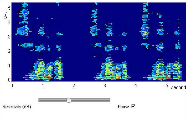
Javascript spectrogram with 3x voice sound "Marco Barnig"

Javascript realtime spectrogram with 3x voice input “Marco Barnig” by microphone

Jan Schnupp  is currently Professor of Neuroscience at the City University of Hong Kong. He is also the author of the website howyourbrainworks.net offering free, accessible introductory online lecture courses to neuroscience.
[HTML1]

Wafesurfer

WaveSurfer is an open source multiplatform tool for sound visualization and manipulation. Typical applications are speech/sound analysis and sound annotation/transcription. WaveSurfer may be extended by plug-ins as well as embedded in other applications. A comprehensive user manual and numerous tutorials for Wavesurfer are available on the net.

WaveSurfer was developed at the Centre for Speech Technology (CCT) at the KTH Royal Institute of Technology in Sweden. The latest stable Windows release (1.8.8p6, May 7, 2020) and the source code of WaveSurfer can be downloaded from Sourceforge. The authors of Wavesurfer are Jonas Beskow and Kåre Sjölander.
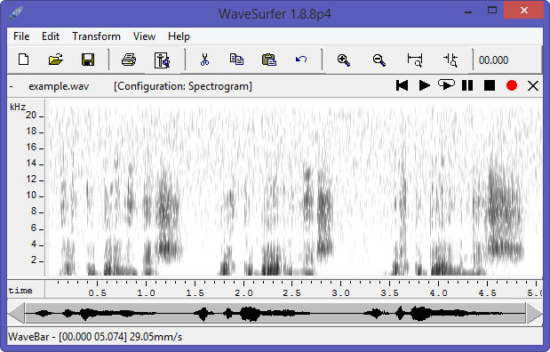
wavesurfer auto

Wavesurfer auto-calculated, auto-sized spectrogram

By right-clicking in the Wafesurfer pane, a pop-up window opens with menus to add more panes, to customize the configuration and to change the parameters for analysis. In the following rendering, the panes Waveform, Pitch Contour, Formant Plot and Transcription have been added to the spectrogram pane and to the Time Axis pane. The spectrogram frequency range was cut at 5 KHz.
[HTML1]
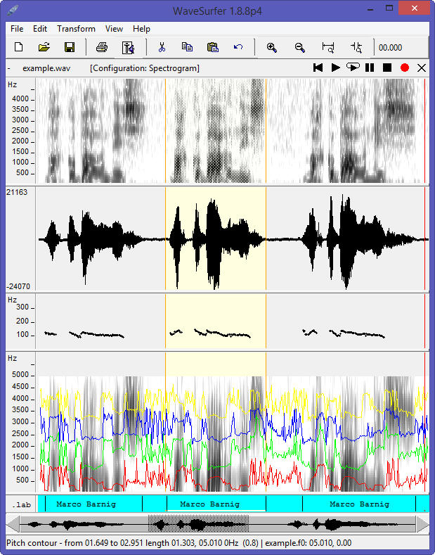
Wafesurfer customized

Wafesurfer customized

Two other panes can be selected: Power Plot and Data Plot. Additional specific panes can be created with plugins.

Wavesurfer uses the Snack Sound Toolkit created by Kåre Sjölander. There exist other software programs with the name Wavesurfer, for example wavesurfer.js, a customizable waveform audio visualization tool, built on top of Web Audio API and HTML5 Canvas by katspaugh.

Spectrogram16

Spectrogram16 is a calibrated, dual channel audio spectrum analyzer for Windows that can provide either a scrolling time-frequency display or a spectrum analyzer scope display in real time for any sound source connected to the sound card. A detailed user guide (51 pages) is joined to the program.
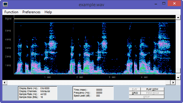
Spectrogram16 customized

Spectrogram16 customized

The tool was created by Richard Horne, the founder of Visualization Software LLC. The company closed  a few years ago. The WayBackMachine shows that Richard Horne announced in 2008 that version 16 of Spectrogram is now freeware (see also local copy). The software is still available from most  free software download websites. Richard Horne, MS, who retired as a Civilian Electrical Engineer for the Navy, was member of the Management Team of Vocal Innovations.

The Spectrogram program was (and is still) appreciated by amateur radio operators for aligning ham receivers.

SFS / RTGRAM

RTGRAM is a free Windows program for displaying a real-time scrolling spectrographic display of an audio signal. With RTGRAM you can monitor the spectro-temporal characteristics of sounds being played into the computer’s microphone or line input ports. RTGRAM is optimised for speech signals and has options for different sampling rates, analysis bandwidths (wideband = 300 Hz, narrowband = 45 Hz), temporal resolution (time per pixel = 1 – 10 ms), dynamic range (30 – 70 dB) and colour maps.
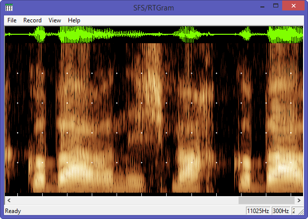
RTGRAM

RTGRAM realtime spectrogram with 3x voice input “Marco Barnig” by microphone

The current version of RTGRAM is 1.3, released in April 2010. It is part of the Speech Filing System (SFS) tools for speech research.

RTGRAM is free, but not public domain software, its intellectual property is owned by Mark Huckvale, University College London.

Audacity

Audacity is a free, open source, cross-platform software for recording and editing sounds. Audacity was started in May 2000 by Dominic Mazzoni and Roger Dannenberg at Carnegie Mellon University. The current version is 3.0.3, released on July 26, 2021.
[HTML1]
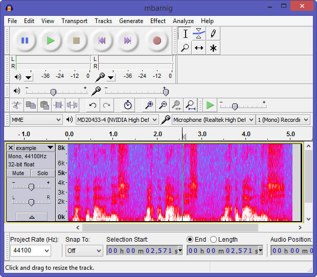
Audacity

Audacity auto-calculated, auto-sized spectrogram

A huge documentation about Audacity with manuals, tutorials, tips, wikis, FAQ’s is available in several languages.

RTS tm

RTS (Real-Time Spectrogram) is a product of Engineering Design, founded in 1980 to address problems in instrumentation and measurement, physical acoustics, and digital signal analysis. Since 1984, Engineering Design has been the developer of the SIGNAL family of sound analysis software. RTS is highly integrated with SIGNAL.

STRAIGHT

STRAIGHT (Speech Transformation and Representation by Adaptive Interpolation of weiGHTed spectrogram) was originally designed to investigate human speech perception in terms of auditorily meaningful parametric domains. STRAIGHT is a tool for manipulating voice quality, timbre, pitch, speed and other attributes flexibly. The tool was invented by Hideki Kawahara when he was in the Advanced Telecommunications Research Institute International (ATR) in Japan. Hideki Kawahara is now Emeritus Professor from the Wakayama University, Japan.

iSound

Irman Abdić created an audio tool (iSound) for displaying spectrograms in real time using Sphinx-4 as part of his thesis at the Faculty of Mathematics, Natural Sciences and Information Technologies (FAMNIT) from Koper, Slovenia.

No Real-Time Spectrogram Software

Other great software programs to create no-realtime spectrograms of recorded voice samples are :

  • Praat
  • SoX
  • SFS / WASP
  • Sonogram Visible Speech

Praat

Praat (= talk in dutch) is a free scientific computer software package for the analysis of speech in phonetics. It was designed, and continues to be developed, by Paul Boersma and David Weenink of the Institute of Phonetics Sciences at the University of Amsterdam. Praat runs on a wide range of operating systems. The program also supports speech synthesis, including articulatory synthesis.
[HTML1]
Praat displays two windows : Praat Objects and Praat Picture.
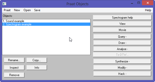
Praat Objects Window
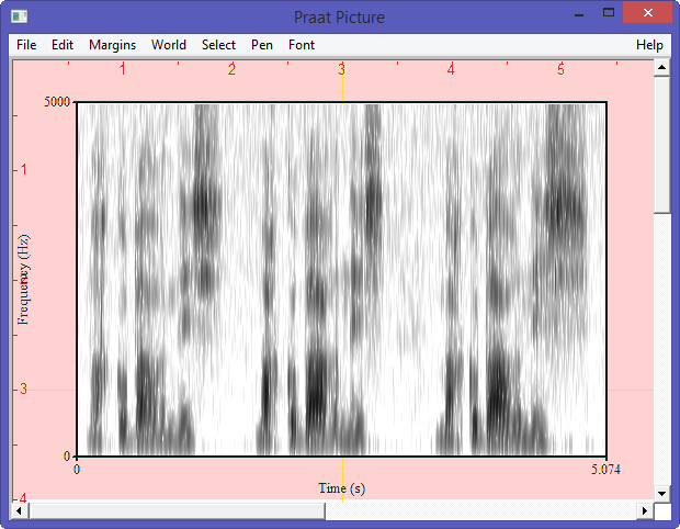
Praat Objects Window

Praat Picture Window

Praat Picture Window

The spectrogram can also be rendered in a customized window.

Praat

Praat customized window

The current version 6.1.51 of Praat was released on August 25, 2021. The source code for this release is available at Github. A huge documentation with FAQ’s, tutorials, publications, user guides is available for Praat. The plugins are located in the directory C:/Users/name/Praat/.

An outstanding plugin for Praat is EasyAlign. It is a user-friendly automatic phonetic alignment tool for continuous speech. It is possible to align speech from an orthographic or phonetic transcription. It requires a few minor manual steps and the result is a multi-level annotation within a TextGrid composed of phonetic, syllabic, lexical and utterance tiers. EasyAlign was developed by Jean-Philippe Goldman at the Department of Linguistics, University of Geneva.

SoX

SoX (Sound EXchange) is a free cross-platform command line utility that can convert various formats of computer audio files in to other formats. It can also apply various effects to these sound files and play and record audio files on most platforms. SoX is called the Swiss Army knife of sound processing programs.

SoX is written in standard C and was created in July 1991 by Lance Norskog. In May 1996, Chris Bagwell started to maintain and release updated versions of SoX. Throughout its history, SoX has had many contributing authors. Today Chris Bagwell is still the main developer.

The current Windows distribution is 14.4.2 released  in February 22, 2015. The source code is available at Sourceforge.

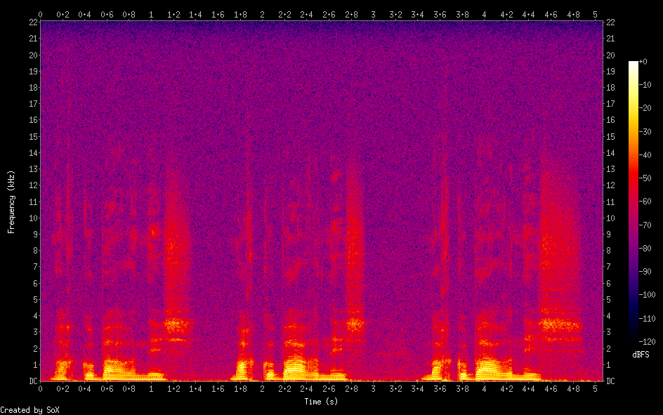
SoX provides a very powerful spectrogram effect. The spectrogram is rendered in a png image-file and shows time in the x-axis, frequency in the y-axis and audio signal amplitude in the z-axis. The z-axis values are represented by the colour of the pixels in the x-y plane. The command

sox example.wav -n spectrogram

creates the following auto-calculated, auto-sized spectrogram :
SoX auto

SoX auto-calculated, auto-sized spectrogram

The main options to customize a spectrogram created with SoX are :


-x num : change the width of the spectrogram from its default value of 800px
-Y num : sets the total height of the spectrogram; the default value is 550px
-z num : sets the dynamic range from 20 to 180 dB; the default value is 120 dB
-q num : sets the z-axis quantisation (number of different colours)
-w name : select the window function; the default function is Hann
-l : creates a printer-friendly spectrogram with a light background
-a : suppress the display of the axis lines
-t text : set an image title
-c text : set an image comment (below and to the left of the image)
-o text : set the name of the output file; the default name is spectrogram.png
rate num k : analyse a small portion of the frequency domain (up to 1/2 num kHz)

[HTML1]
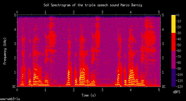
A customized rendering follows :
SoX

Customized SoX spectrogram

The customized SoX spectrogram was created with the following command :

sox example.wav -n rate 10k spectrogram -x 480 -y 240 -q 4 -c "www.web3.lu" 
-t "SoX Spectrogram of the triple speech sound Marco Barnig"

WASP

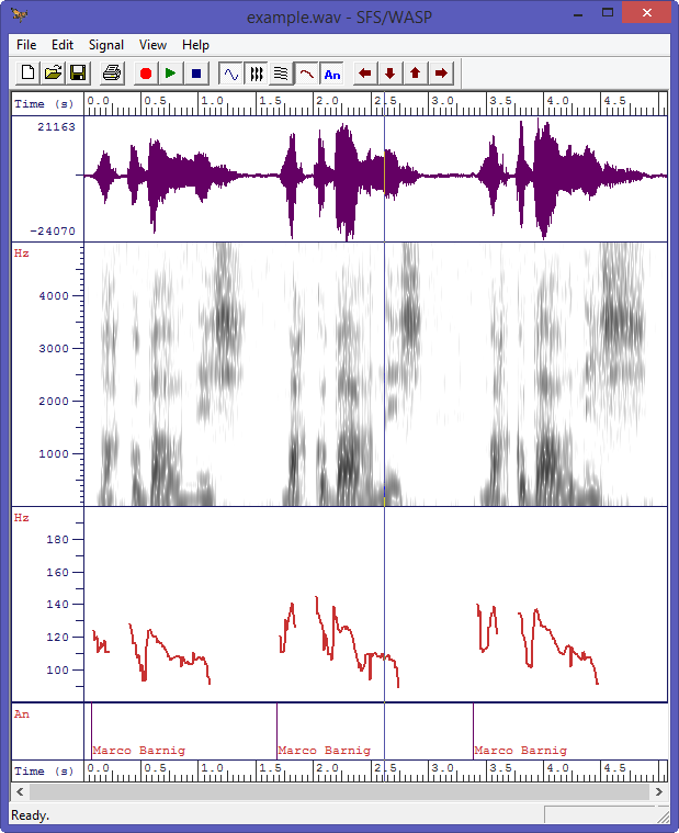
WASP is a free Windows program for the recording, display and analysis of speech. With WASP you can record and replay speech signals, save them and reload them from disk, edit annotations, and display spectrograms and a fundamental frequency track. WASP is a simple application that is complete in itself, but which is also designed to be compatible with the Speech Filing System (SFS) tools for speech research. The current version 1.80 was released in June 2020.
[HTML1]
The following figure shows a customized WASP window with a  speech waveform pane, a wideband spectrogram, a pitch track and annotations.
WASP customized spectrogram

WASP customized spectrogram with pitch and annotation tracks

WASP is free, but not public domain software, its intellectual property is owned by Mark Huckvale, University College London.
[HTML1]

Sonogram Visible Speech

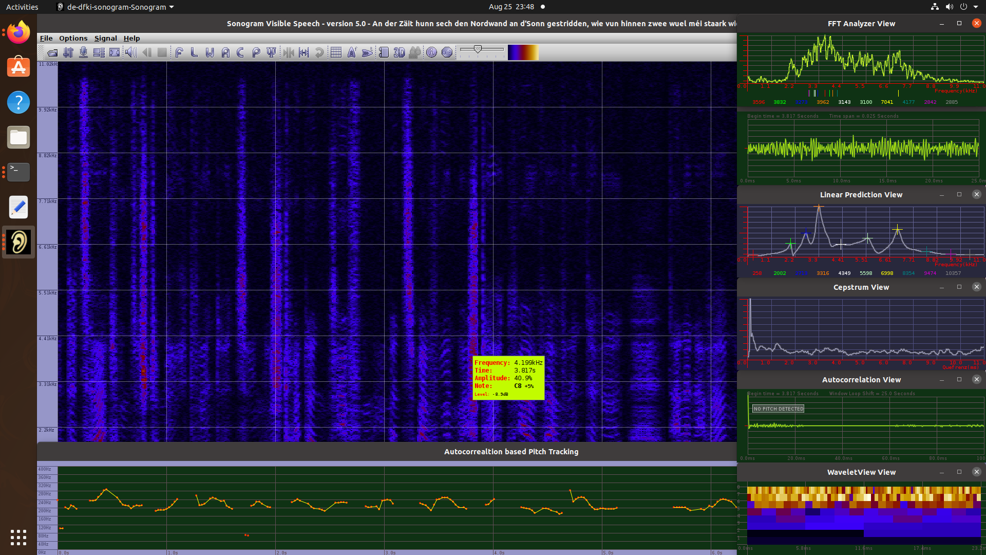
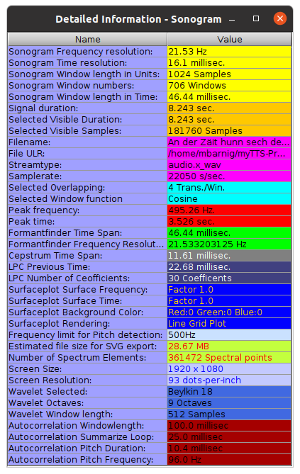
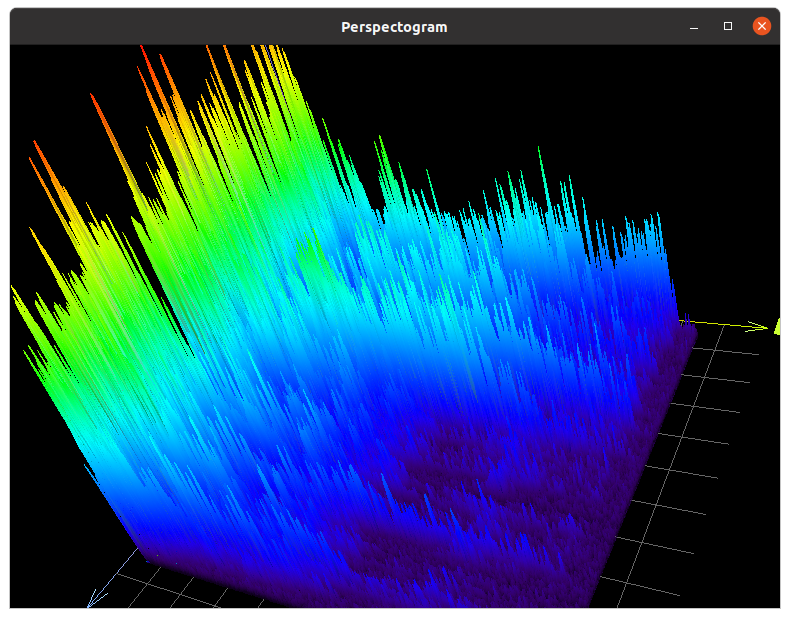
Sonogram Visible Speech is a very advanced program for sound, music and speech analysis. It provides multiple tools to perform various transformations and spectral studies on audio signals and to display the results in numerous panels : perspectogram, pitch, wavelet, cepstrum, 3D plots, auto-correlation charts etc.

In short terms, Sonogram is a  powerful and complex audio spectrum analyzer with a comprehensive GUI layout.

Sonogram Visible Speech Main Window

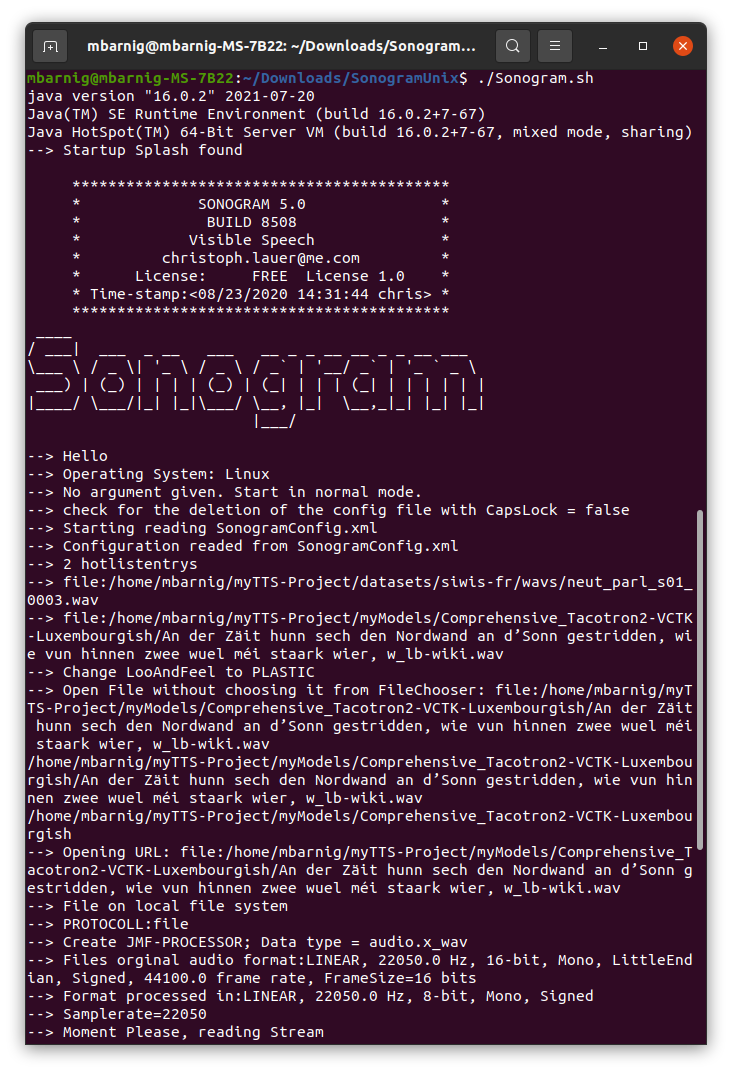
Sonogram is programmed in Java and needs Java Runtime in version 16 at least. It runs in Windows, MacOS and Unix/Linux. The current version 5 has been released in August 18, 2021. The source code is available at Github. The next figure shows the start of the program in a Linux terminal.

Program Start with Sonogram.sh

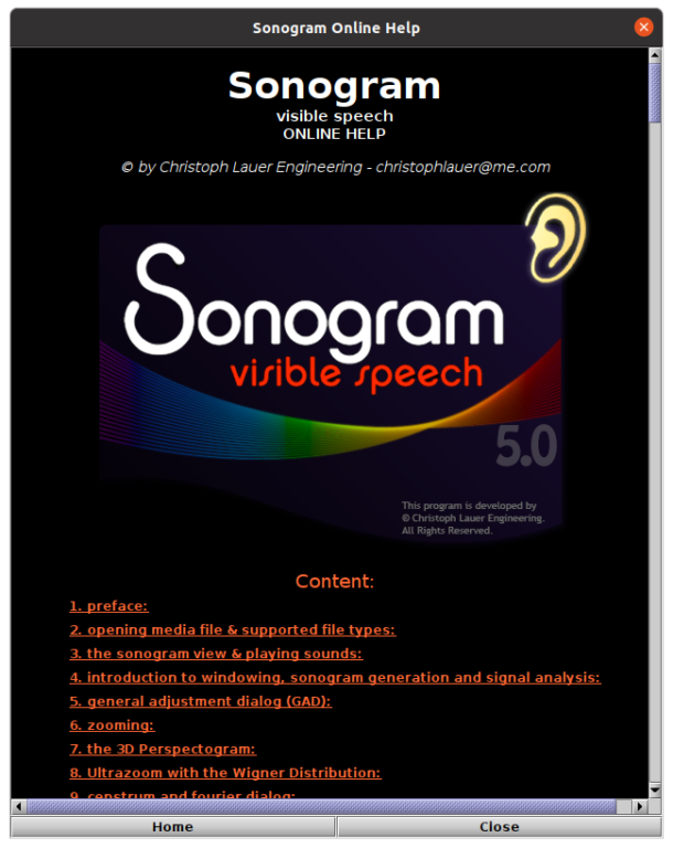
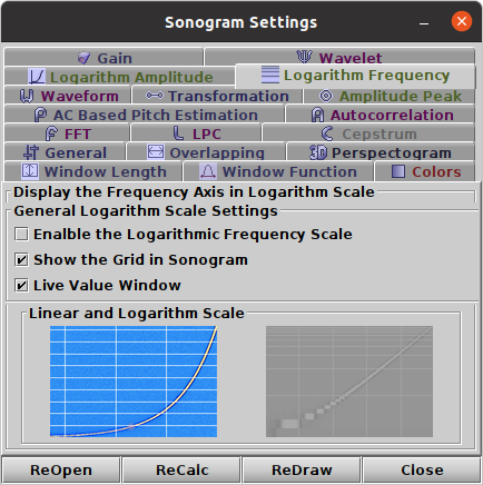
The following files show the help-, settings- and info-panels:

Sonogram Online Help


Sonogram Settings


Sonogram Detailed Info

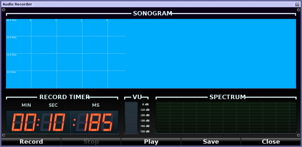
Sonogram includes a 3D-chart to present processed sound signals in three dimensions and a convenient audio recorder.

3D Perspectogram


Sonogram Audio Recorder

Sonogram Visible Speech was programed from 2000 to 2021 by Christoph Lauer. When he started the project he worked at the DFKI (Deutsches Forschungsinstitut für künstliche Intelligenz) in Saarbrücken. In December 2007 he joined the Saarland University as a scientific assistant, two years later the IDTM (Fraunhofer Institute for Digital Media Technology) as an Audio DSP Researcher. Since 2014 Christoph Lauer  works as a Machine Learning Researcher for the BMW Group.

Specific Spectrogram Software

Spectrograms can also be used for teaching, artistic or other curious purposes :

  • FaroSon
  • SpectroTyper
  • ImageSpectrogram

FaroSon

FaroSon (The Auditory Lighthouse), is a Windows program for the real-time conversion of sound into a coloured pattern representing loudness, pitch and timbre. The loudness of the sound is reflected in the brightness and saturation of the colours. The timbre of the sound is reflected in the colours themselves: sounds with predominantly bass character have a red colour, while sounds with a predominantly treble character have a blue colour. The pitch of the sound is reflected in the horizontal banding patterns: when the pitch of the sound is low, then the bands are large and far apart, and when it is high, the bands are narrow and close together. If the pitch of the sound is falling you see the bands diverge; when it is rising, you see the bands converge.
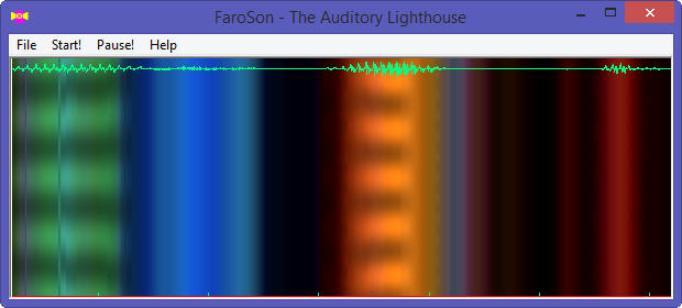
Faroson

Faroson

FaroSon is free, but not public domain software, its intellectual property is owned by Mark Huckvale, University College London.

SpectroTyper

AudioCheck offers the Internet’s largest collection of online sound tests, test tones, and tone generators. Audiocheck provides a unique online tool called SpectroTyper to insert plain text into a .wav sound file. The downloaded file plays as cool-sounding computer-like tones and is secretly readable from a spectrogram view (linear frequency scale best). It can be used for fun, to hide easter eggs in a music production or to tag copyrighted audio material with own identifiers or source informations.

Here is the barnig_txt.wav sound file with my integrated name as an example, the result is shown below in the SoX spectrogram, created with the command :

sox barnig_txt.wav -n rate 10k spectrogram -x 480 -y 120
Spectro

SoX Spectrogram of a sound with inserted text, synthesized with SpectroTyper

SpectroTyper and other audio tools and tone generators have been created by Stéphane Pigeon, a research engineer & sound designer from Belgium. He received the degree of electrical engineering from the Université Catholique de Louvain (UCL) in June 1994, with a specialization in signal processing. He finalized a PhD thesis in applied science in 1999. Then, Stéphane Pigeon joined the Royal Military Academy as a part-time researcher. In parallel, he worked as a consultant, exclusively for Roland Corporation in the area of the musical instrument market. He designed various audio-related websites, like AudioCeck.net started in 2007. He also released some iOS apps. His most succesful project is myNoise.net, started in 2013, which offers a unique collection of online noise generators.

ImageSpectrogram

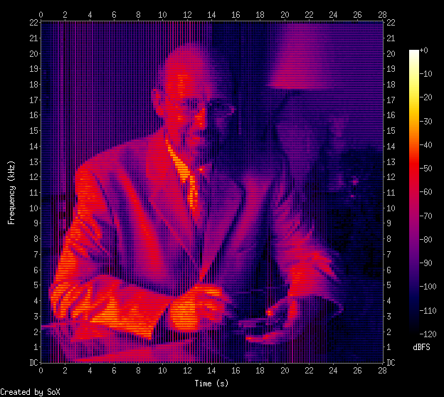
Richard David James, best known by his stage name Aphex Twin, is an British electronic musician and composer. In 1999, he released Windowlicker as a single on Warp Records. In this record he synthesized his face as a sound, only viewable in a spectrogram.

Gavin Black (alias plurSKI) created a perl script to do the same : take a digital picture and convert it into a wave file. Creating a spectrogram of that file then reproduces the original picture.

[HTML1]
Here is the barnig_portrait.wav sound file with my integrated portrait as an example, the result is shown below in the SoX spectrogram, created with the command :

sox barnig_portrait.wav -n spectrogram -x 480 -y 480
Spectro

SoX Spectrogram of a sound with inserted picture, synthesized with imageSpectrogram

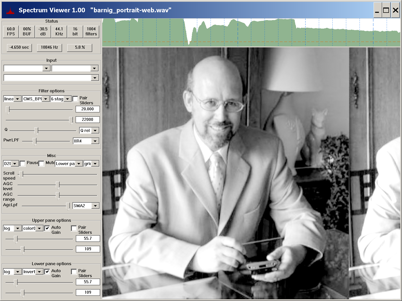
On July 24, 2022, Scott Duplichan published an Audio SpectrumViewer for Windows on Sourceforge. During the development he used the wav-sample with my embedded portrait to test his realtime spectrum viewer. Scott found a converter to create a better image with a smaller wav-file.

The spectrum viewer app contains a demo folder with an audioFileImage subfolder where you can start batch-files to compare the original with the improved spectrum. The result with the new converter is shown in the following screen-shot:

Links

A list with links to websites providing additional informations about spectrograms is presented below :

Mary TTS (Text To Speech)

Last update : January 5, 2017

MaryTTS is an open-source, multilingual Text-to-Speech Synthesis platform written in Java. It was originally developed as a collaborative project of DFKI’s Language Technology Lab and the Institute of Phonetics at Saarland University. It is now maintained by the Multimodal Speech Processing Group in the Cluster of Excellence MMCI and DFKI (Deutsches Forschungszentrum für Künstliche Intelligenz GmbH).

Mary stands for Modular Architecture for Research in sYynthesis. The earliest version of MaryTTS was developed around 2000 by Marc Schröder. The current stable version is 5.2, released on September 15, 2016.

I installed Mary TTS on my Windows, Linux and Mac computers. On the Mac (OSX 10.10 Yosemite), version 5.1.2 of Mary TTS was placed on the desktop in the folders marytts-5.1.2 and marytts-builder-5.1.2. The Mary TTS Server is started first by opening a terminal window in the folder marytts-5.1 with the following command :

marytss-5.1.2 mbarnig$ bin/marytts-server.sh

To start the Mary TTS client with the related GUI, a second terminal window is opened in the same folder  with the command :

marytss-5.1.2 mbarnig$ bin/marytts-client.sh

On Windows , the related scripts are marytts-server.bat and marytts-client.bat.

As the development version 5.2 of Mary TTS supports more languages and comes with toolkits for quickly adding support for new languages and for building unit selection and HMM-based synthesis voices, I downloaded a snapshot-zip-file from Github with the most recent source code. After unzipping, the source code was placed in the folder marytts-master on the desktop.

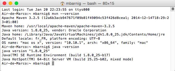
To compile Mary TTS from source on the Mac, the latest JAVA development version (jdk-8u31-macosx-x64.dmg) and Apache Maven (apache-maven-3.2.5-bin.tar.gz), a software project management and comprehension tool, are required.

On Mac, Java is installed in

/Library/Java/JavaVirtualMachines/jdk1.8.0_31.jdk/Contents/Home/

and Maven is installed in

/usr/local/apache-maven/apache-maven-3.2.5

It is important to set the environment variables $JAVA_HOME, $M2_HOME and the $PATH to the correct values (export in /Users/mbarnig/.bash-profile).

The succesful installation of Java and Maven can be verified with the commands :

mbarnig$ java -version
mbarnig$ mvn --version

marytts-maven-java

Mary TTS : Maven and Java versions

This looks good!

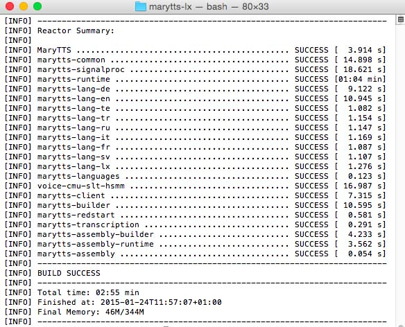
In the next step I compiled the Mary TTS source code by running the command

marytts-master mbarnig$ mvn install

in the top-level marytts-master folder. This build the system, run unit and integration tests, packaged the code and installed it in the following folders :

marytts-master/target/marytts-5.2.SNAPSHOT
marytss-master/target/marytss-builder-5.2-SNAPSHOT

The build took 2:55 minutes and was succesful, without errors or warnings.

mary

Results of building MARYTTS 5.2 SNAPSHOT

The following modules have been compiled :

  • MaryTTS
  • marytts-common
  • marytts-signalproc
  • marytts-runtime
  • marytts-lang-de, en, te, tr, ru, it, fr, sv, lx (lx is a pseudo locale for a test language)
  • marytts-languages
  • marytts-client
  • marytts-builder
  • marytts-redstart
  • marytts-transcription
  • marytts-assembly with the sub-modules assembly-builder and assembly-runtime
  • voice_cmu_slt_hsmm

After checking the whole file structure, I started the Mary TTS 5.2 server

marytts-snapshot-server

Mary TTS snapshot 5.2 Server

and the Mary TTS 5.2 client

marytts-snapshot-client

Mary TTS Snapshot 5.2 client

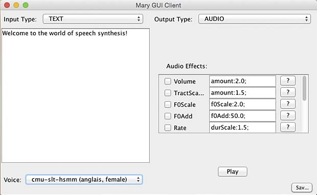
did some trials with text to audio conversion in the GUI window

marytts-gui-client

Mary TTS Client GUI

launched the Mary TTS 5.2 component installer

Mary TTS Component Installer

Mary TTS Component Installer

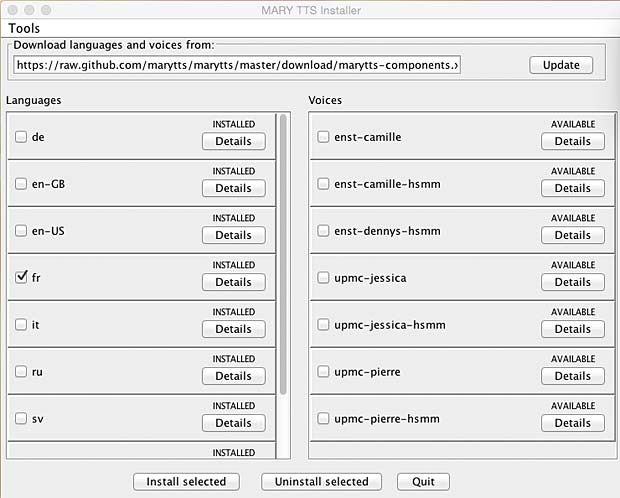
and finally installed some french, german and english available voices.

marytts-installer

Mary TTS Voice Installer GUI

In the next step I will try to create my own voices and develop a voice for the luxembourgish language.

In January 2017, I updated my systems with the stable MaryTTS version 5.2 which supports the luxembourgish language.

eSpeak Formant Synthesizer

Last update : November 2, 2014

eSpeak

eSpeak is a compact multi-platform multi-language open source speech synthesizer using a formant synthesis method.

eSpeak is derived from the “Speak” speech synthesizer for British English for Acorn Risc OS computers, developed by Jonathan Duddington in 1995. He is still the author of the current eSpeak version 1.48.12 released on November 1, 2014. The sources are available on Sourceforge.

eSpeak provides two methods of formant synthesis : the original eSpeak synthesizer and a Klatt synthesizer. It can also be used as a front end for MBROLA diphone voices. eSpeak can be used as a command-line program or as a shared library. On Windows, a SAPI5 version is also installed. eSpeak supports SSML (Speech Synthesis Marking Language) and uses an ASCII representation of phoneme names which is loosely based on the Kirshenbaum system.

In formant synthesis, voiced speech (vowels and sonorant consonants) is created by using formants. Unvoiced consonants are created by using pre-recorded sounds. Voiced consonants are created as a mixture of a formant-based voiced sound in combination with a pre-recorded unvoiced sound. The eSpeakEditor allows to generate formant files for individual vowels and voiced consonants, based on a sequence of keyframes which define how the formant peaks (peaks in the frequency spectrum) vary during the sound. A sequence of formant frames can be created with a modified version of Praat, a free scientific computer software package for the analysis of speech in phonetics. The Praat formant frames, saved in a spectrum.dat file, can be converted to formant keyframes with eSpeakEdit.

To use eSpeak on the command line, type

espeak "Hello world"

There are plenty of command line options available, for instance to load from file, to adjust the volume, the pitch, the speed or the gaps between words, to select a voice or a language, etc.

To use the MBROLA voices in the Windows SAPI5 GUI or at the command line, they have to be installed during the setup of the program. It’s possible to rerun the setup to add additional voices. To list the available voices type

espeak --voices

eSpeak uses a master phoneme file containing the utility phonemes, the consonants and a schwa. The file is named phonemes (without extension) and located in the espeak/phsource program folder. The vowels are defined in the language specific phoneme files in text format. These files can also redefine consonants if you wish. The language specific phoneme text-files are located in the same espeak/phsource folder and must be referenced in the phonemes master file (see example for luxembourgish).

....
phonemetable lb base
include ph_luxembourgish

In addition to the specific phoneme file ph_luxembourgish (without extension), the following files are requested to add a new language, e.g. luxembourgish :

lb file (without extension) in the folder espeak/espeak-data/voices : a text file which in its simplest form contains only 2 lines :

name luxembourgish
language lb

lb_rules file (without extension) in the folder espeak/dictsource : a text file which contains the spelling-to-phoneme translation rules.

lb_list file (without extension) in the folder espeak/dictsource : a text file which contains pronunciations for special words (numbers, symbols, names, …).

The eSpeakEditor (espeakedit.exe) allows to compile the lb_ files into an lb_dict file (without extension) in the folder espeak/espeak-data and to add the new phonemes into the files phontab, phonindex and phondata in the same folder. These compiled files are used by eSpeak for the speech synthesis. The file phondata-manifest lists the type of data that has been compiled into the phondata file. The files dict_log and dict_phonemes provide informations about the phonemes used in the lb_rules and lb_dict files.

eSpeak applies tunes to model intonations depending on punctuation (questions, statements, attitudes, interaction). The tunes (s.. = full-stop, c.. = comma, q.. = question, e.. = exclamation) used for a language can be specified by using a tunes statement in the voice file.

tunes s1  c1  q1a  e1

The named tunes are defined in the text file espeak/phsource/intonation (without extension) and must be compiled for use by eSpeak with the espeakedit.exe program (menu : Compile intonation data).

meSpeak.js

Three years ago, Matthew Temple ported the eSpeak program from C++ to JavaScript using Emscripten : speak.js. Based on this Javascript project, Norbert Landsteiner from Austria created the meSpeak.js text-to-speech web library. The latest version is 1.9.6 released in February 2014.

meSpeak.js is supported by most browsers. It introduces loadable voice modules. The typical usage of the meSpeak.js library is shown below :

<!DOCTYPE html>
<html lang="en">
<head>
 <title>Bonjour le monde</title>
 <script type="text/javascript" src="mespeak.js"></script>
 <script type="text/javascript">
 meSpeak.loadConfig("mespeak_config.json");
 meSpeak.loadVoice("voices/fr.json");
 function speakIt() {
 meSpeak.speak("Bonjour le monde");
 }
 </script>
</head>
<body>
<h1>Try meSpeak.js</h1>
<button onclick="speakIt();">Speak It</button>
</body>
</html>

Click here to test this example.

The mespeak_config.json file contains the data of the phontab, phonindex, phondata and intonations files and the default configuration values (amplitude, pitch, …). This data is encoded as base64 octed stream. The voice.json file includes the id of the voice, the dictionary used and the corresponding binary data (base64 encoded) of these two files. There are various desktop or online Base64 Decoders and Encoders available on the net to create the required .json files (base64decode.org, motobit.com, activexdev.com, …).

meSpeak cam mix multiple parts (diiferent languages or voices) in a single utterance.meSpeak supports the Web Audio API (AudioContext) with internal wav files, Flash is used as a fallback.

Links

A list with links to websites providing additional informations about eSpeak and meSpeak follows :

Language : fr, de, en, lb, eo

Last update : November 7, 2021

Language is the human capacity for acquiring and using complex systems of communication, and a language is any specific example of such a system. The scientific study of language is called linguistics.

In the context of a text-to-speech (TTS) and automatic-speech-recognition (ASR) project, I assembled the following informations about the french, german, english, luxembourgish and esperanto languages.

French

French is a romance language spoken worldwide by 340 million people. The written french uses the 26 letters of the latin script, four diacritics appearing on vowels (circumflex accent, acute accent, grave accent, diaeresis) and the cedilla appearing in ç. There are two ligatures, œ and æ. The french language is regulated by the Académie française. The language codes are fr (ISO 639-1), fre, fra (ISO 639-2) and fra (ISO 639-3).

The spoken french language distinguishes 26 vowels, plus 8 for Quebec french. There are 23 consonants. The Grand Robert lists about 100.000 french words.

German

German is a West Germanic language spoken by 120 million people. In addition to the 26 standard latin letters, German has three vowels with Umlauts and the letter ß called Eszett. German is the most widely spoken native language in the European Union. The german language is regulated by the Rat für deutsche Rechtschreibung. The language codes are de (ISO 639-1), ger, deu (ISO 639-2) and 22 variants in ISO 630-3.

The spoken german language uses 29 vowels and 27 consonants. The 2013 relase of the Duden lists about 140.000 german words.

English

English is a West Germanic language spoken by more than a billion people. It is an official language of almost 60 sovereign states and the third-most-common native language in the world. The written english uses the 26 letters of the latin script, with rare optional ligatures in words derived from Latin or Greek. There is no regulatory body for the english language. The language codes are en (ISO 639-1) and eng (ISO 630-2 and ISO 639-3).

The spoken english language distinguishes 25 vowels and 34 consonants, including the variants used in the United Kingdom and the United States. The Oxford English Dictionary lists more than 250,000 distinct words, not including many technical, scientific, and slang terms.

Luxembourgish

Luxembourgish (Lëtzebuergesch) is a Moselle Franconian variety of West Central German that is spoken mainly in Luxembourg by about 400.000 native people. The Luxembourgish alphabet consists of the 26 Latin letters plus three letters with diacritics: é, ä, and ë. In loanwords from French and German, the original diacritics are usually preserved. The luxembourgish language is regulated by the Conseil Permanent de la Langue Luxembourgeoise (CPLL). The language codes are lb (ISO 639-1) and ltz (ISO 630-2 and ISO 639-3).

The spoken luxembourgish language uses 22 vowels (14 monophthongs, 8 diphthongs) and 26 consonants. The luxembourgish-french dictionary dico.lu icludes about 50.000 words, the luxembourgish-german dictionary luxdico lists about 26.000 words. The full online Luxembourgish dictionary www.lod.lu is in construction, at present words beginning with A-S may be accessed via the search engine.

Esperanto

Esperanto is a constructed international auxiliary language. Between 100,000 and 2,000,000 people worldwide fluently or actively speak Esperanto. Esperanto was recognized by UNESCO in 1954 and Google Translate added it in 2012 as its 64th language. The 28 letter Esperanto alphabet is based on the Latin script, using a one-sound-one-letter principle. It includes six letters with diacritics: ĉ, ĝ, ĥ, ĵ, ŝ (with circumflex), and ŭ (with breve). The alphabet does not include the letters q, w, x, or y, which are only used when writing unassimilated foreign terms or proper names. The language is regulated by the Akademio de Esperanto. The language codes are eo (ISO 639-1) and epo (ISO 630-2 and ISO 639-3).

Esperanto has 5 vowels, 23 consonants and 2 semivowels that combine with the vowels to form 6 diphthongs. The core vocabulary of Esperanto contains 900 roots which can be expanded into tens of thousands of words using prefixes, suffixes, and compounding.

Links

A list with links to websites with additional informations about the five languages (mainly luxembourgish) is shown hereafter :

Phonemes, phones, graphemes and visemes

Phonemes

A phoneme is the smallest structural unit that distinguishes meaning in a language, studied in phonology (a branch of linguistics concerned with the systematic organization of sounds in languages). Linguistics is the scientific study of language. Phonemes are not the physical segments themselves, but are cognitive abstractions or categorizations of them. They are abstract, idealised sounds that are never pronounced and never heard. Phonemes are combined with other phonemes to form meaningful units such as words or morphemes.

A morpheme is the smallest meaningful (grammatical) unit in a language. A morpheme is not identical to a word, and the principal difference between the two is that a morpheme may or may not stand alone, whereas a word, by definition, is freestanding. The field of study dedicated to morphemes is called morphology.

Phones

Concrete speech sounds can be regarded as the realisation of phonemes by individual speakers, and are referred to as phones. A phone is a unit of speech sound in phonetics (another branch of linguistics that comprises the study of the sounds of human speech).  Phones are represented with phonetic symbols. The IPA (International Phonetic Alphabet) is an alphabetic system of phonetic notation based primarily on the Latin alphabet. It was created by the International Phonetic Association as a standardized representation of the sounds of oral language.

In IPA transcription phones are conventionally placed between square brackets and phonemes are placed between slashes.

English Word : make
Phonetics : [meik]
Phonology : /me:k/   /maik/   /mei?/

A set of multiple possible phones, used to pronounce a single phoneme, is called an allophone in phonology.

Graphemes

Analogous to the phonemes of spoken languages, the smallest semantically distinguishing unit in a written language is called a grapheme. Graphemes include alphabetic letters, typographic ligatures, chinese characters, numerical digits, punctuation marks, and other individual symbols of any of the world’s writing systems.

Grapheme examples

Grapheme examples

In transcription graphemes are usually notated within angle brackets.

<a>  <W>  <5>  <i>  <> <>  <ق>

A grapheme is an abstract concept, it is represented by a specific shape in a specific typeface called a glyph. Different glyphs representing the same grapheme are called allographs.

In an ideal phonemic orthography, there would be a complete one-to-one correspondence between the graphemes and the phonemes of the language. English is highly non-phonemic, whereas Finnish come much closer to being consistent phonemic.

Visemes

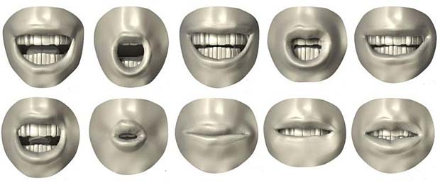
A viseme is a generic facial shape that can be used to describe a particular sound. Visemes are for lipreaders, what phonemes are for listeners: the smallest standardized building blocks of words. However visemes and phonemes do not share a one-to-one correspondence.

Visemes

Visemes

Links

A list with links to websites with additional informations about phonemes, phones, graphemes and visemes is shown hereafter :

Picture element and srcset attribute

Last update : July 5, 2014

Jason Grigsby outlined two years ago that there are two separate, but related requirements that need to be addressed regarding the use of the <img> element in responsive designs :

  1. enable authors to provide different resolutions of images based on different environmental conditions
  2. enable authors to display different images under different conditions based on art direction

Resolution Switching

When we handle an image for Retina displays, it makes sense to deliver a crispy, high resolution picture to the browser. When we send the same image to a mobile with a small screen or to a tablet connected with low speed, it’s efficient to save bandwidth and to reduce the loading and processing time by providing a small size picture.

In HTML, a browser’s environmental conditions are primarily expressed as CSS media features (orientation, max-width, pixel-density, …) and CSS media types (screen, print, …). Most media features are dynamic (a browser window is resized, a device is rotated, …). Thus a browser constantly responds to events that change the properties of the media features. Swapping images provides a mean to continue communication effectively as the media features change dynamically.

Art Direction

When we display an image about a subject (i.e. the brain structure) at a large size, it makes sense to show the context. When we display the same image on a small screen, it’s useful to crop it and to focus on a detail. This differentiation is ruled by art direction.

art

for small screens a detail looks better than the resized original (Wikipedia) picture

Breakpoints

The @media query inside CSS or the media tag inside the link element are the key ingredients for responsive design. There are several tactics for deciding where to put breakpoints (tweak points, optimization points). As there are no common screen sizes, it doesn’t make sense to base the breakpoints on a particular screen size. A better idea is to look at the classic readability theory and to break the layout if the width of a column exceeds 75 characters or 10 words. These are the breakpoints. Vasilis van Gemert created a simple sliding tool to show the impact of language and font family on the text width.

Lucky responsive techniques

In the recent past, web developers relied on various techniques (CSS background images, Javascript libraries, semantically neutral elements, <base> tag switching, …) to use responsive images in their applications.  All of these techniques have significant limits and disadvantages (bypassing the browser’s preload scan, redundant HTTP requests, complexity, high processing time, …).  For all these reasons a standardized solution was wanted.

Possible responsive image solutions

The proposed solutions to deal with one or with both of the requirements for responsive images (“resolution switching” and “art-direction“) are the following :

  • <picture> element : addresses requirement #2 (the author selects the image series and specifies the display rules for the browser)
  • srcset and sizes attributes : addresses requirement #1 (the browser selects the image resolution based on informations provided by the author)
  • CSS4 image-set : addresses requirement #1 (the browser selects the images based on informations provided by the author)
  • HTTP2 client hints : addresses requirements #1 and #2 (the server select the images based on rules specified by the author)
  • new image format : addresses requirement #1 (there is only one image)

Responsive image standardization

On June 20, 2014, Anselm Hannemann, a freelance front-end developer from Germany, announced on his blog that the <picture> element and the attributes srcset and sizes are now web standards. The discussions and debates about the specification of a native responsive images solution in HTML lasted more than 3 years inside WHATWG, RICG and W3C.

The Responsive Images Community Group (RICG) is a group of developers working towards a client-side solution for delivering alternate image data based on device capabilities to prevent wasted bandwidth and optimize display for both screen and print. RICG is a community group of the World Wide Web Consortium (W3C). The group is chaired by Mathew Marquis of the Filament Group and has 362 participants, among them the Responsive Web Design pioneers Nicolas Gallagher, Bruce Lawson, Jason Grigsby, Scott Jehl, Matt Wilcox and Anselm Hannemann.

The RICG drafted a picture specification (editors draft July 1, 2014) with the new HTML5 <picture> element and the srcset and sizes attributes that extends the img and source elements to allow authors to declaratively control or give hints to the user agent about which image resource to use, based on the screen pixel density, viewport size, image format, and other factors.

Bruce Lawson was the first to propose the <picture> element and he has a degree of attachment to it. The srcset attribute was presented on the WHATWG mailing list by someone from Apple. At first, the majority of developers favored the <picture> element and the majority of implementors favored the srcset attribute. The W3C states how the priority should be given when determining standards:

In case of conflict, consider users over authors over implementors over specifiers over theoretical purity.

Both WHATWG and W3C included now the <picture> element and the srcset and sizes attributes to the HTML5 specification. The links are given below :

The <picture> element

The use of the <picture> element is shown in the following code examples :

<picture>
 <source srcset="brain-mobile.jpg, brain-mobile-x.jpg 2x">
 <source media="(min-width: 480px)" srcset="brain-tablet.jpg, 
    brain-tablet-hd.jpg 2x">
 <source media="(min-width: 1024px)" srcset="brain-desktop.jpg, 
    brain-desktop-hd.jpg 2x">
 <img src="brain.jpg" alt="Brain Structure">
</picture>

With a mobile-first approach, the image “brain-mobile.jpg” is rendered by default, the image “brain-tablet.jpg” is rendered if the user screen is at least 480px wide, and “brain-desktop.jpg” is rendered if the user screen is at least 1024px wide. The image “brain.jpg” is destinated to those browsers who don’t understand the <picture> element. The second URL in the srcset attribute is paired with the string 2x, separated by a space, that targets users with a high-resolution display (like the Retina with a pixel density 2x).

<picture>
<source sizes="100%" srcset="brain-mobile.jpg 480w, 
brain-tablet.jpg 768w, brain-desktop.png 1024w">
<img src="brain.jpg" alt="Brain Structure">
</picture>

In the second example the sizes attribute is used to let the image cover all the width of the device (100%), regardless of its actual size and pixel density. The browser will automatically calculate the effective pixel density of the image and choose which one to download accordingly.

The four images brain-mobile.jpg, brain.jpg, brain-tablet.jpg and brain-desktop.jpg not only have different dimensions, but may  also have different content. This way authors are enabled to display different images under different conditions, based on art direction.

The <picture> element should not be confused with the HTML5 <figure> element which represents some flow content. The <figure> element is able to have a caption, typically the <figcaption> element.

<figure>
   <figcaption>Brain Structure</figcaption> 
   <img src="brain.jpg" alt="Brain Structure" width="320"/>
</figure>

The sizes syntax is used to define the size of the image across a number of breakpoints. srcset then defines an array of images and their inherent sizes.

The srcset attribute

The srcset is a new attribute for use in the <img> elements. Its value is a comma separated list of images for the browser to choose from. An simple example is shown below :

<img srcset="brain-low-res.jpg 1x, brain-hi-res 2x, width="320"
alt="Brain Structure">

We tell the browser that there is an image to be rendered at 320 CSS pixels wide. If the device has a normal 1x screen, a low resolution image 320 x 240 pixels is loaded. I the device has a pixel ratio of 2 or more, a higher resolution image 640 x 480 pixels is requested from the server by the browser.

Here comes a second example :

<img src="brain.jpg" sizes="75vw" 
srcset="brain-small.jpg 320w, brain-medium.jpg 640w, 
brain-large.jpg 1024w,brain-xlarge.jpg 2000w" 
alt="Brain Structure">

The srcset attribute tells the browser which images are available with their respective pixel widths. It’s up to the browser to figure out which image to load, depending on the viewport width, the pixel ratio, the network speed or anything else the browser feels is relevant.

The sizes attribute tells the browser that the image should be displayed at 75% of the viewport width. The sizes attribute is however more powerful than indicating default length values. The format is :

sizes="[media query] [length], [media query] [length] ... etc"

Media queries are paired with lengths. Lengths can be absolute (pixel, em) or relative (vw). The next exampe shows a use-case:

<img src="brain.jpg" 
sizes="(min-width:20em) 240px,(min-width:48em) 80vw, 65vw"
srcset="brain-small.jpg 320w, brain-medium.jpg 640w, 
brain-large.jpg 1024w,brain-xlarge.jpg 2000w" 
alt="Brain Structure">

We tell the browser that in viewports between 0 and 20 em wide the image should be displayed  240 pixels wide, in viewports between 20 em and 48 em wide the image should take up 80% of the viewport and in larger viewports the image should be 65% wide.

Can I use responsive images ?

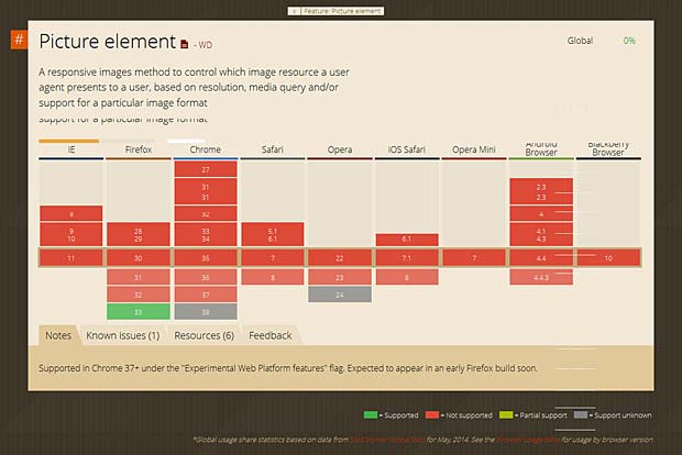
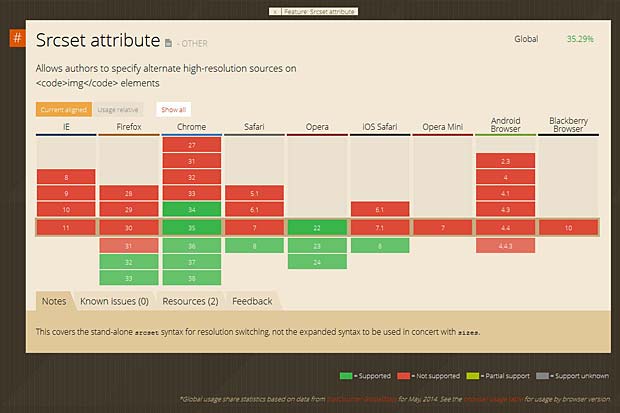
The support of the <picture> element and the srcset and sizes attributes in the various browsers can be checked at the “Can I Use” website. This site was built and is managed by Alexis Deveria, it provides up-to-date support tables of front-end web technologies on desktop and mobile browsers.

Support of the picture element in browsers

Support of the picture element in browsers (Can I Use Website)

Support of the srcset attribute in browsers

Support of the srcset attribute in browsers (Can I User Website)

Actually the <picture> element is only supported by Firefox version 33. The srcset attribute is only supported by Firefox versions >32, Chrome versions > 34, Safari version 8 and Opera versions > 22.

PictureFill

The poor support of the <picture> element and the srcset attribute in actual browsers does not mean that you have to wait before implementing responsive images in your website. Scott Jehl from Filament Group developped a great polyfill called PictureFill supporting the <picture> element and the srcset and sizes attributes.

Initialization code :

<script>
// Picture element HTML5 shiv
document.createElement( "picture" );
</script>
<script src="picturefill.js" async></script>

<picture> code :

<picture>
<!--[if IE 9]><video style="display: none;"><![endif]-->
<source srcset="brain-xx.jpg" media="(min-width: 1000px)">
<source srcset="brain-x.jpg" media="(min-width: 800px)">
<source srcset="brain.jpg">
<!--[if IE 9]></video><![endif]-->
<img srcset="brain.jpg" alt="Brain Structure">
</picture>

If JavaScript is disabled, PictureFill only offers alt text as a fallback. PictureFill supports SVG and WebP types on any source element, and will disregard a source if its type is not supported. To support IE9, a video element is wrapped around the source elements using conditional comments.scrset code :

<img sizes="(min-width: 40em) 80vw, 100vw"
srcset="brain-s.jpg 375w,brain.jpg 480w,brain-x.jpg 768w" 
alt="Brain Structure">

The PictureFill syntax is not quite the same as the specification. The fallback src attribute was intentionally removed to prevent images from being downloaded twice.

CSS4 image-set

By using the CSS4 image-set function, we can insert multiple images which will be set for normal and high-resolution displays. The image-set function is declared within the background-image property, while the background URL is added within the function followed by the resolution parameter (1x for normal display and 2x is for high-res display), like so :

.selector { 
 background-image: image-set(url('image-1x.jpg') 1x, 
 url('image-2x.jpg') 2x); 
} 

The CSS4 image-set function is also trying to deliver the most appropriate image resolution based on the connection speed. So, regardless of the screen resolution, if the user accesses the image through a slow Internet connection, the smaller-sized image will be delivered.

CSS4 image-set is still experimental. It is only supported in Safari 6 and Google Chrome 21 where it is prefixed with -webkit.

HTTP2 client hints

The responsive image standards leave the burden to create images at appropriate sizes, resolutions and formats to the web developer. Client hints are a way to offload this work to the server. Client hints are HTTP headers that give the server some information about the device and the requested resource. Ilya Grigorik, web performance engineer and developer advocate at Google, submitted in December 2013 an Internet Draft “HTTP client hints” to the Internet Network Working Group of the Internet Engineering Task Force (IETF). The draft specifies two new headers for the HTTP 2.0 version : CH-DPR for device pixel ratio and CH-RW for resource width. A server-side script will generate the best image for the requesting device and deliver it.

New image formats

There are some new image formats like JPEG2000, JPEG XR and WebP that generate higher quality images with smaller file sizes, but they aren’t widely supported. JPEG 2000 is scalable in nature, meaning that it can be decoded in a number of ways. By truncating the codestream at any point, one may obtain a representation of the image at a lower resolution. But the web already has this type of responsive image format, which is progressive JPEG, if we get the browsers to download only the neccesary bytes of the picture (i.e. with the byte range HTTP header). The main problem is that the new image formats will take long to implement and deploy, and will have no fallback for older browsers.

Links

The following list provides links to websites with additional informations about <picture>, srcset, PictureFill and related topics :

Responsive iFrames and Image Maps

Last update : June 27, 2014

Some HTML elements don’t work with responsive layouts. Among these are iFrames, which you may need to use when embedding content from external sources. Other elements are Image Maps which are lists of coordinates relating to a specific image, created in order to hyperlink areas of the image to different destinations.

Responsive iFrames

When you embed content from an external source with an iFrame, you must include width and height attributes. Wihtout these parameters, the iframe will disappear because it would have no dimensions. Unfortunaltely you can’t fix this in your css style sheet.

To make embedded content responsive, you need to add a containing wrapper around the iframe :
<div class="iframe_container">
<iframe src="http://www.yoursite.com/yourpage.html" width="640" height="480">
</iframe>
</div>

The containing wrapper is styled with the .iframe_container class in the style sheet :
.iframe_container {
position: relative;
padding-bottom: 75%;
height: 0;
overflow: hidden;
}

Setting the position to relative lets us use absolute positioning for the iframe itself. The padding-bottom value is calculated out of the aspect ratio of the iFrame, which in this case is 480 / 640 = 75%. The height is set to 0 because padding-bottom gives the element the height it needs. The width will automatically resize with the responsive element included in the wrapping div. Setting overflow to hidden ensures that any content flowing outside of this element will be hidden from view.

The iFrame itself is styled with the following CSS code :
.iframe_container iframe {
position: absolute;
top:0;
left: 0;
width: 100%;
height: 100%;
}

Absolute positioning must be used because the containing element has a height of 0. The top and left properties position the iFrame correctly in the containing element. The width and height properties ensure that the iFrame takes up 100% of the space used by the containing element set with padding.

Responsive Image Maps

Image maps are a co-ordinate representations of images in sections mostly in rectangular, poly and circle format. According to the specs percent values can be used for coordinates, but no major browsers understand them correctly and all interpret coordinates as pixel coordinates. The result is that image maps applied to responsive images don’t work as expected when images are resized. It’s necessary to recalculate the area coordinates to match the actual image size.

There are different solutions available to make Image Maps responsive :

The following demo shows a responsive Image Map embedded in a responsive iFrame :
[HTML2]

Links

The list below shows links to websites sharing additional informations about responsive iFrames and Image Maps :


Wearable Technology

The term Wearable technology refers to clothing and accessories incorporating computer and advanced electronic technologies. The designs often incorporate practical functions and features, but may also have a purely critical or aesthetic agenda.

Other terms used are wearable devices, wearable computers or fashion electronics. A healthy debate is emerging over whether wearables are best applied to the wrist, to the face or in some other form.

Smart watches

A smart watch is a computerized wristwatch with functionality that is enhanced beyond timekeeping. A first digital watch was already launched in 1972, but the production of real smart watches started only recently. The most notable smart watches which are currently available or announced are listed below :


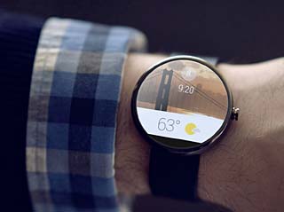
Android Wear

Android Wear

On March 18, 2014, Google officially announced Android’s entrance into wearables with the project Android Wear. Watches powered by Android Wear bring you :

  • Useful information when you need it most
  • Straight answers to spoken questions
  • The ability to better monitor your health and fitness
  • Your key to a multiscreen world

An Android Wear Developer Preview is already available. It lets you create wearable experiences for your existing Android apps and see how they will appear on square and round Android wearables. Late 2014, the Android Wear SDK will be launched enabling even more customized experiences.

Google Glass


Google Glass

Google Glass

Google Glass is a wearable computer with an optical head-mounted display (OHMD). Wearers communicate with the Internet via natural language voice commands. In the summer of 2011, Google engineered a prototype of its glass. Google Glass became officially available to the general public on May 15, 2014, for a price of $1500 (Open beta reserved to US residents). Google provides also four prescription frames for about $225. Apps for Goggle Glass are called Glassware.

Tools, patterns and documentation to develop glassware are available at Googles Glass developer website. An Augmented Reality SDK for Google Glass is available from Wikitude.

Smart Shirts

Smart shirts, also known as electronic textiles (E-textiles) are clothing made from smart fabric and used to allow remote physiological monitoring of various vital signs of the wearer such as heart rate, temperature etc. E-textiles are distinct from wearable computing because emphasis is placed on the seamless integration of textiles with electronic elements like microcontrollers, sensors, and actuators. Furthermore, E-textiles need not be wearable. They are also found in interior design, in eHealth or in baby brathing monitors.

At the Recode Event 2014, Intel recently announced its own smart shirt which uses embedded smart fibers that can tell you things about your heart rate or other health data.

VanGoYourself

VanGoYourself : The Last Supper, Leonardo da Vinci

VanGoYourself : The Last Supper, Leonardo da Vinci

La plateforme VanGoYourself permet à toute personne, partout dans le monde, de recréer des œuvres d’art de la Grande Région. Environ 50 peintures de plus de dix collections de sept pays européens peuvent être reproduites sur VanGoYourself.

Les meilleures récréations ont été publiées sur le site web www.vangoyourself.com et toutes les soumissions peuvent être consultées sur vangoyourself.tumblr.com.

VanGoYourself est une innovation Europeana et est le fruit d’une collaboration européenne dans le cadre du projet « Europeana Creative ». Le concept de VanGoYourself est né de la volonté de deux organisations à but non lucratif : Culture24 en Angleterre et Plurio.net au Luxembourg. Toutes deux sont engagées pour étendre la visibilité des arts et de la culture.

Stop killing my iPhone battery

Last Update : January 19, 2017

One of the biggest complaints about the Apple mobile operating system iOS7 is how easily it drains your iPhone battery. Here are a few quick fixes to keep iOS 7 devices powered for much longer :

  • disable the Background App refresh (actualisation en arrière plan)
  • turn off Location Services completely or disable certain apps one by one
  • reduce the motion of the user interface in accessibility (set parameter to “on”)
  • disable the automatic updates option
  • turn off AirDrop
  • turn off all notifications for unnecessary apps
  • turn off unnecessary system services
  • disable Auto-Brightness and decrease the setting manually
  • disable what you don’t need in Apple’s internal search functionality called Spotlight
  • close open apps : you can can close multiple apps at once by double clicking the home button to reveal open webpages and platforms, then swipe up to three apps at the same time by using three fingers and dragging them upwards.

The following list provides links to additional informations about the iPhone battery power-saving options :