Hide text with CSS

Sometimes you need to use an image, with text, for the background of an input button or an image link. This can be the case when you want to have a regular value in a button so that screen readers and people surfing without CSS can still figure out what the input says.

To hide the text with CSS, there are several possibilities :

  • set the font-size value to zero : the CSS specification does not indicate how browsers should display text when the font-size is set to a value of zero; many browsers handle it unpredictably
  • set the color of the text to transparent : it works in new browsers, including IE 9, but not in older IE versions
  • position the text out of the screen with left:-9999px or text-indent:-9999px
  • set the text invisible with span {display:none;} or span {visibility:hidden;}

The W3C published a technique using CSS to hide a portion of the link text as part of Techniques and Failures for Web Content Accessibility Guidelines 2.0.

CSS Mediaqueries

Last update : June 26, 2014

The CSS3 module that defines mediaqueries reached the W3C Recommendation status in June 2012 and offers introspection into the browsing environment based on the following factors:

  • browser dimensions (width, height and aspect-ratio)
  • device dimensions (device-width, device-height and device-aspect-ratio)
  • browser orientation
  • colour information (color, color-index and monochrome)
  • device-specific details such as its resolution, whether its display is grid or bitmap-based, and the scan type (progressive or interlaced … applicable to televisions)

Not all of these properties are currently supported, but many are. Additionally, most of them support min and max prefixes like the one used below, enabling you to tailor your queries very specifically.

@media screen and (max-width:480px) {
background-color:red;
font-size:1.5em;
}

This set of styles is only applied to a screen which is 480 pixels wide or less.

A mediaquery test capabilities, not individual devices or browsers, so it’s future proof. There is no redirection to a different page, it’s one page for all. The mediaquery is tested before any assets are downloaded, saving bandwith and speeding up the display.

Some useful tutorials about mediaqueries are listed hereafter :

CSS Positioning

Last update : November 24, 2014

The layout properties available in CSS are :

  • position : static
  • position : relative
  • position : absolute
  • position : fixed
  • float : left or float : right

The default CSS positioning for all elements is position:static; the element is not positioned and occurs where it normally would in the document. With position:relative, elements are moved relative to where it would normally occur in the document with the parameters top, bottom, right or left. With position:absolute, the element is removed from the document and placed exactly where the parameters top, bottom, right or left tell it to go.

A combination of a relative and absolute positionned div’s allows to make a two-column layout. An advantage to using absolute positioning is that we can position the elements in any order on the page, regardless of the order they appear in the HTML. A disadvantage is that other elements are obscured by the absolutely positioned elements. This can be avoided if a fixed height is set on the absolute positionned elements, but if the text displayed in this element is longer or the font size is changed, new problems appear. A better solution for variable height columns is to float an element to push it as far as possible to the right or to the left, and allow text to wrap around it. Two elements floated to the same side will push up against each other. To push down the rest of the content the floats can be cleared after the floating elements.

Position:fixed behaves like position:absolute, but it will position an element in reference to the browser window as opposed to the web page. Fixed elements should stay exactly where they are on the screen even when the page is scrolled.

There is a divide between web designers saying you should use absolute positioning and web designers saying you should use floats, both claiming that the other method breaks faster. Both are right, it depends on the situation. There is a simple rule :

If elements should not interact, use absolute positioning, if they should, use floats.

Another benefit of floats is the progressive downloading; as the text is loaded it is displayed onto the page immediately.

Links to examples of layouts with different positionned elements are listed hereafter ( look at the sourcecode of the webpages to view the CSS code) :

Links to some useful tutorials about CSS positioning are shown in the following list :

HTML CSS Box Model

last update: November 23, 2014

HTML CSS Box Model

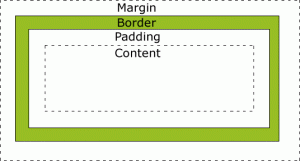
All HTML elements can be considered as boxes. The CSS Box Model is shown in the figure at left.

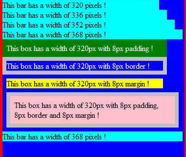
The width and height properties specified for an element with CSS refers only to the content area. To get the full size of the element, you must also add the padding, the border and the margin.
The different parts are :

Firefox

Padding, border and margin are added to the lengths

  • Margin : transparent area around the border
  • Border : a border around the padding and content with a border color
  • Padding : clears an area around the content with the background color of the box
  • Content : where text and images appear

Padding is the inner space of an element, whereas margin is the outer space of an element. Border is in the middle. The following figures shows the three properties for different browsers :

Firefox - IE9 - Chrome - Safari

Firefox-33 * IE-9 * Chrome-39 * Safari-5.1

In CSS, it is possible to specify different margins for different sides :

margin-top:25px;
margin-right:50px;
margin-bottom:75px;
margin-left:100px;

These margins can also be declared as a shorthand property :

margin:25px 50px 75px 100px;

The values are set clockwise, starting for the top. The same is true for padding. The CSS border properties allow you to specify the style, width and color of an element’s border. The border-style values are :

  • none
  • solid
  • dashed
  • double
  • groove
  • ridge
  • outset

None of the other border properties will have any effect unless the border-style property is set! The border width can be specified in pixels (px) or with the three pre-defined values: thin, medium, or thick.

The shorthand code to set the border is :

border:5px solid red;

The order of the values are : border-width, border-style, border-color.

The following list provides links to websites with additional informations about the CSS Box Model and related topics :

Advanced stuff about CSS selectors

Last update : June 24, 2014

CSS selectors are made up of a pattern that is matched against all elements in the document tree, it’s the part that comes before the opening curly brace. The selector types are :

  • Universal : *  (Matches any element)
  • Type :  p  (Matches  element p)
  • Class :  .info (Matches any element whose class attribute contains the value info)
  • ID : #temp (Matches any element with an id equal to temp)
  • Descendant : p b (Matches any b element that is a descendant of an p element)
  • Child : p > b (Matches any b element that is a child of an p element)
  • Adjacent : p + b (Matches any b element immediately preceded by a sibling element p)
  • Attribute : p[att condition] (Matches any p element whose att attribute is compliant to the condition)
  • Pseudo-Class : p:action (Matches p during certain  actions; pseudo-classes are first-child, link, visited, active, hover, focus, lang(cc))
  • Pseudo-Element : p:content (Matches p for certain contents; pseudo-elements are first-line, first-letter, before, after)

CSS Selectors can be grouped and combined :

  • Multiple class selectors :p.info.error {color:#900;font-weight:bold;}(Matches p elements which have both “info” and “error” in their list of class names)
  • Descendant selectors :div#temp li p.info { color:#f00; }(Matches all p elements with a class name of “info” that are contained by an li element that is contained by a div element with the id “temp”)
  • Child selectors :p > strong { color:red }(Matches all strong elements that are children of a p element)
  • Adjacent siblings selectors :p + p { color:green }(Matches an element p which is the next sibling p to the first element)
  • Grouping :#my1, #my2,  #my3 {color:blue}(Matches all elements with the id’s my1, my2 and my3)
  • Attributes selectors :p[lang|=en] { color:yellow }(Matches all elements whose lang attribute starts with “en”)

:before and :after

The :before and :after pseudo-elements can be used to insert generated content before or after an element’s content.

3 digit color hex codes:

The 3 digit only hex codes are shorthand for the codes that have the numbers repeated in pairs.

#06C = #0066CC

z-index:

The z-index property specifies the stack order of an element. An element with greater stack order is always in front of an element with a lower stack order. z-index only works on positioned elements (position:absolute, position:relative, or position:fixed). An element with a negative value is displayed behind any with an undefined or positive z-index value in the same stacking context.

Some useful links about CSS are :

Viewports for mobile devices and tablet PC’s : a pixel is not a pixel

Last update : June 24, 2014

Designing a webpage which looks good on desktop PC’s, mobile devices and tablet PC’s is challenging. You have to optimize your content at least for screens that are 320px, 480px, 768px, and 1024px wide. One tool to reach this goal is the viewport meta tag.

The viewport meta tag was introduced by Apple for the iPhone, and it has since been picked up by Microsoft for Windows Mobile, by Nokia for Maemo and by Android. Remember however that the viewport has nothing to do with the device. The viewport is the browser and more precisely the window of the browser. Recently the W3C published a draft of a CSS Device Adaptation based on the viewport meta tag.

The tag is ignored by regular desktop browsers.

<meta name="viewport" content="width=800" />

Mobile Safari presents desktop-sized websites on small screens by rendering to a virtual browser screen that is 980 pixels wide. Opera assumes a page to be 850 pixels wide. Pages on the iPad in portrait mode and on other mobile devices are scaled down.  Pages can be zoomed and panned. Viewport tags tell the Mobile Safari that the website displays properly narrower than 980 pixels. The webpage can be set for other scaling preferences.

Apple suggests to avoid hard-coding a width for the viewport and to use the physical device-width to set the viewport :

<meta name="viewport" content="width=device-width" />

This setting makes one CSS pixel equal to one device pixel. The physical device-width refers to the screen size in portrait mode. One problem is that the content is blowed up if the device is oriented in landscape mode. To avoid blow-up, a maximum scale factor can be applied :

<meta name="viewport" content="width=device-width, maximum-scale=1.0" />

You can add the attribute “user-scalable=no” to disable the pinch-to-zoom feature :

<meta name="viewport" content="width=device-width, user-scalable=no" />

This is useful for preventing accidental zooms and makes web apps feel more app-like, but most users might want to see the content at a larger size.

The complete list of viewport properties for iPad (and iPhone with Retina display) is given below :

  • width : 200 – 10.000 ; default : 980
  • height : 223 – 10.000
  • minimum-scale : 0.0 – 10.0 ; default : 0.25
  • maximum scale : 0.0 – 10.0 ; default : 1.6
  • initial-scale : between min and max
  • user-scalable : yes / no ; default : yes

To hide the control-bar which consumes about 60 pixels, the following script can be used :

<body onload="setTimeout(function() { window.scrollTo(0, 1) }, 100);"></body>

To deal with the greatly differing screen sizes, CSS media queries allow to specify completely different stylesheets depending on how large the screen is.

<link media="only screen and (max-device-width: 480px)" href="small.css" type= "text/css" rel="stylesheet">
<link media="only screen and (min-device-width: 481px) and (max-device-width: 1024px)" href="medium.css" type="text/css" rel="stylesheet">
<link media="screen and (min-device-width: 1025px)" href="large.css" type="text/css" rel="stylesheet">

Instead of using separate css-files, the media query can be used inside a single css-file :

@media only screen and (min-device-width: 481px) and (max-device-width: 1024px)
{
styles
}

In fact it’s useful to consider two viewports : one based on device pixels, the other based on CSS pixels. Only at zoom level 100% one CSS pixel is exactly equal to one device pixel.

The iPhone 4’s Retina display has a far larger physical pixel density than previous iPhones. Still, it reports 320px for the device-width media query (as well as JavaScript screen.width) both with and without the meta viewport width=device-width.

A few links about useful tutorials about viewports and other related subjects are listed herafter :

The next list shows links to iPad and iPhone simulators to test the rendering of webpages on these devices :

YUI compressor for Javascript and CSS

The YUI Compressor is a JavaScript compressor which, in addition to removing comments and white-spaces, obfuscates local variables using the smallest possible variable name.

The YUI Compressor is also able to safely compress CSS files. The decision on which compressor is being used is made on the file extension (js or css).

The YUI Compressor is written in Java and relies on Rhino to tokenize the source JavaScript file. It starts by analyzing the source JavaScript file to understand how it is structured. It then prints out the token stream, omitting as many white space characters as possible, and replacing all local symbols by a letter symbol wherever such a substitution is appropriate . The CSS compression algorithm uses a set of finely tuned regular expressions to compress the source CSS file. The YUI Compressor is open-source.

Several GUI’s are available :

Online versions are available at the website of Zileex Media, of  Rodolphe Stoclin and of gpbmike.

How to make an iPhone web app ?

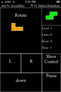
Tetris web app for iPhone

An iPhone web application (web app) uses Web 2.0 technologies to deliver a focused solution that looks and behaves like a native iPhone application. iPhone web apps run in Safari on iPhone, the unique implementation of Safari that provides full-featured web browsing on iOS-based devices and responds to touch-based gestures.

The Apple Safari Developer / Reference Library provides guides, tutorials, code samples, FAQ’s  and best practices about the creation of web content for iOS devices. The Safari Web Content Guide, the HTML Reference, the CSS Reference and the JavaScript Guide are key documents.

A very useful tutorial about the creation of an off-line Tetris game for an iPhone has been published by Alex Kessinger on the Six Revisions Website. A tutorial about how to install a web app on iPhones has been written by jeshyr on the iTalk Magazine.

There are several tools and frameworks available to build html5/css3 web apps for iPhones or for other mobiles (cross-platforms). A list of a few ones is shown herafter :

  • iWebKit 5 : an outstanding kit with copy and paste elements designed by Christopher Plieger and Johan Van Wilsum to create iPhone web apps.
  • Appcelerator Titanium : an SDK for different application environments. The SDK provides the necessary tools, compilers and APIs for building for the target platform.
  • Sencha Touch : a free HTML5 mobile JavaScript framework that allows you to develop mobile web apps that look and feel native on iPhone and Android touchscreen devices.
  • PhoneGap : an open source development framework for building cross-platform mobile apps with support of core features in iPhone/iPod touch, iPad, Google Android, Palm, Symbian and Blackberry SDKs.
  • Corona : fast and easy development tool for iPhone, iPad and Android games and applications.
  • jQuery Mobile : Touch-Optimized Web Framework for Smartphones & Tablets.
  • iUI: iPhone User Interface Framework
  • Dashcode : part of Apples iPhone SDK

There are also tools and simulators to test created web apps :

  • Bugaboo : an App for debugging web apps on iPhone, iPad, and iPod touch devices, downloadable from the Apple App Store.
  • iPhone  simulator : web browser based simulator

You have to be aware that there are some differences between iPhone native Apps and web apps.

A native App runs code (Objective-C program) on the device and is installable through the App store (if approved by Apple). You have access to all the UI elements the iPhone uses and can do things like 3D which are impossible in the Safari browser. You need a mac to make a native App, but you can make web apps with any platform of your choice.

A web app is accessed via the Safari browser and requires no install. You are just going to a website that has a special stylesheet for the iPhone. Because a web app can also be installed on an iPhone with a custom icon, a custom startup screen, a native look-and-feel and can be used even when the phone is not connected to the Internet, the differences between Apps and web apps are becoming very small.

There are a lot of native Apps that could be run more efficient as web apps. And there are tools to convert a web app into a native App. Make your choice !

Image Slicing and CSS Sprites

Last update: December 29, 2011

It’s often discussed whether or not slicing  images  makes them load faster on the web. In the past images slicing was used to  benefit from human perception that makes it seem like the page is loading faster when small pieces are displayed in sequence.  In reality  load time is increased due to the additional simultaneous requests to the web server. The total file size of sliced images is reduced if each slice is compressed to optimal settings.

Today, the contrary of slicing  is done. Separate graphics are grouped in one large image collection. It’s far easier on the server to serve a single large image than many small ones and it’s faster for a web browser to load such an image.

Problems related to css sprites are :

  • No encapsulation: If you want to change one image, you have to change the sprite
  • Don’t degrade: If the browser don’t support CSS, you are in trouble
  • Memory footprint: When sprites get loaded into the browser, they are stored uncompressed and can take up a huge memory
  • read/maintain/modify your CSS. It can be difficult to remember the exact pixel offsets within the sprite

Here is a list with links to useful webpages about related topics :