Last update: February 12, 2017
Digital imaging is the creation of digital images, such as of a physical scene, and includes the processing, compression, storage, printing, and display of such images. The information is converted by image sensors into digital signals that are processed by a computer. If the medium which conveys the information that constitutes the image is visible light, it’s called digital photography.
Photosensor Array
A digital camera or a scanner uses an array of photosensors (photosites) to record and store photons. Once the exposure finishes, the relative quantity of photons in each photosite is then sorted into various intensity levels, whose precision is determined by bit depth (0 – 255 for an 8-bit image).
One photosensor per image pixel would only create grayscale pictures. To capture color images, distinct photosensors are necessary for each of the three primary colors (RGB). To separate the colors, a filter array is placed over each photosensor. The most common type of color filter array is called a Bayer Array, as shown in the figure below.
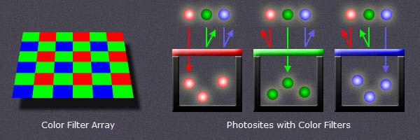
image credit : www.cambridgeincolour.com
A Bayer Array consists of alternating rows of red-green and green-blue filters. Because the human eye is more sensitive to green light than both red and blue light, the Bayer Array contains twice as many green as red or blue sensors to approximate the human vision.
Dynamic Range
When speaking about dynamic range, we need to distinguish between recordable or displayable dynamic range. Let’s start with the first one.
The Dynamic Range in digital imaging describes the ratio between the maximum (white) and minimum (black) measurable light intensities. The black level (few photons) is limited by noise. The white level (large number of photons) is limited by overflow (saturation). If an ideal photosensor identifies one photon for black and hosts a maximum of 1.000 photons (white), the dynamic range would be 1.000:1. The most commonly used unit for measuring dynamic ranges in digital photography is the f-number (f-stop) which describes the total light range by powers of 2. A dynamic range of 1.000:1 is therefore equivalent to 10 f-stops (2 exp 10 = 1.024). In scanners the dynamic range is described in terms of density (D). Density is measured using powers of 10. A dynamic range of 1.000:1 is represented by a density of 3 (10 exp 3 = 1.000). As a scanner has full control over it’s light source, such a device can ensure that minimal photosensor overflow occurs.
The approximated dynamic range in f-stops for several devices is indicated below :
| recordable | displayable |
|
|
ISO sensitivity
How much light is needed to saturate a medium is determined by it’s sensitivity. That was as true for glass plates as it was for film and now for digital photosensors. The sensitivity (film speed) is expressed in ISO. The normal range of ISO is about 200 to 1.600, but can sometimes go as low as 50 or as high as 204.800.
Image Bit Depth
Bit depth quantifies how many values are available to specify each image pixel. Even if a digital imaging system can capture a vast dynamic range, the light measurements must be translated into discrete numerical values with an analog to digital (A/D) converter. With 8 bits per color channel, the dynamic range cannot exceed 8 f-stops (density of 2.4) if the numerical values are linearly interspaced. With 16 bits per color channel, the theoretical value for the dynamic range in an ideal linear system would be 16 f-stops (densitiy 4.8). In practice the dynamic range of a linear system is much lower, even with 16 bits (typically about 12 f-stops). If we use however an nonlinear system to interspace and save the discrete numerical values, we could even conceive to record an infinite dynamic (posterized) range with an image depth of a few bits.
RAW image
At the end of the A/D conversion, we have a raw digital image, with W x H pixels, specified with consecutive discrete numerical values, each value coded with N bits per color channel. Each camera manufacturer and each scanner software developer uses a proprietary format for a raw digital image. A common format called Digital Negative (DNG) has been defined by Adobe in 2004.
Image Histograms
Image histograms are great tools to evaluate the correct exposure of a captured digital image.
Each pixel in the raw image is specified by the primary colors red, green and blue (RGB). Each of these colors can have a brightness value ranging from 0 to X ( X = 2 exp N ). A histogram results when the computer scans through each of the brightness values and counts how many are at each level from 0 through X. Low brightness values are called shadows, high values are the highlights, in-between are the midtones.
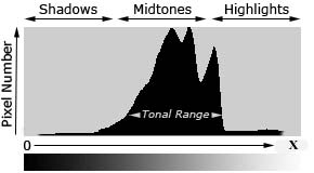
Histogram
A well balanced histogram where no shadows or highlights are clipped is shown at left. The region where most of the brightness values are present is called the tonal range. When highlights are heaped at the right edge in the histogram, they are clipped (blown). Some regions in the image have been overexposed and the corresponding details can never been recovered.
When shadows are heaped at the left edge in the histogram, some regions of the image have been underexposed and the relevant dark details are also lost. The histogram of a raw digital image should not present high values at the left (shadows) and right (highlights) edges of the chart. If clipping occurs you see a tall vertical line at the far left or right side of the histogram.
Usually an image is underexposed if no channel of the histogram goes all the way to the right. Images that are too dark are easy to correct later in this case; just drag the right slider in Photoshop’s Levels command to the left to meet the edge of the histogram.
The distribution of peaks in a histogram depends on the tonal range of the subject. Images where most of the tones occur in the shadows are called low key, whereas in high key images most of the tones are in the highlights. The histogram describes also the contrast which is the measure of the difference in brightness between dark and light areas in an image. Broad histograms reflect a significant contrast, narrow histograms present low contrast resulting in flat (dull) images.
All histograms are normalized and are intentionally scaled so that the top of the tallest peak always reach full height. Scale is relative, shown percentage-wise.
There exist three types of image histograms :
- Color Histograms
- RGB Histograms
- Luminosity (Luminance) Histograms
Each histogram type has it’s own use and it’s own shortcomings. All three should be used as a collective tool. The following figures show the different histograms relative to a scanned Kodachrome slide of a landscape.

Scanned Kodachrome slide of a landscape
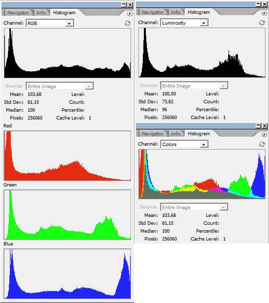
Landscape photo histogram windows RGB, R, G, B, Luminosity and Colors in Photoshop
Color Histograms
A color histogram describes the brightness distribution for any of the three primary color channels R, G, B. This is helpful to assess whether or not individual colors have been clipped.
Sometimes color histograms are presented as color overlays (colors histogram).
RGB Histograms
An RGB histogram produces three independent histograms for each color channel and then adds them together, irrespective of whether the color came from the same pixel. This way RGB histograms discard the location of each pixel.
Luminosity (Luminance) Histograms
The terms luminosity and luminance are often used interchangeably, even though each describes a different aspect of light intensity. Technically the term luminosity is correct and I will use it in the following, even if luminance is more common. The luminosity histogram takes into account that our eyes are most sensitive to green; we see green as being brighter than we see blue or red. Luminosity weighs the effect of this to indicate the actual perceived brightness of the image pixels based on the NTSC television formula
Luminosity = Red x 0.3 + Green x 0.59 + Blue x 0.11Color Models
Until now we have used the terms primary colors (RGB), color channels, color and colors histograms, luminosity, luminance, light intensity, brightness, but we never really dealt with colors.
The search for a comprehension of exactly what color is and how it functions has been going on for hundreds of years. Artists and philosophers have theorized that color is three-dimensional. Contemporary neuroscientists have confirmed this theory, finding that our sensation of color comes from nerve cells that send messages to the brain about:
- The brightness of color
- Greenness versus redness
- Blueness versus yellowness
Numerous models and systems have been developed :
- Aristotle (350 BC) : colors are rays sent down from the heavens by God ( 4 colors : earth, fire, wind, and water)
- Sigfrid Forsius (1611) : Physical Manuskript
- François d’Aguilon (Aguilonius – 1613) : Opticorum libri se
- Isaac Newton (1704) : OPTICKS
- Jacob Christoph Le Blon (1768) : L’Art d’imprimer des tableaux
- Thomas Young (1802) : On the Theory of Light and Colours
- Philipp Otto Runge (1807) : Farbenkugel
- Johann Wolfgang von Goethe (1810) : Zur Farbenlehre
- James Clerk Maxwell (1860) : On the Theory of Colour Vision
- Michel Eugène Chevreul (1861) : Chromatic Diagram
- Hermann von Helmholtz (1867) : Handbuch der Physiologischen Optik
- Charles Albert Keeley (1873) : Colour Conundrum
- Ewald Hering (1892) : Opponent Color Theory
- Albert Henri Munsell (1915) : Color Tree
- Wilhelm Ostwald (1916) : Die Farbenfiebel
There are several ways to associate the converted discrete numerical values of the primary color channels R, G, B to colors. We can rely on the physics of light waves (visible spectrum), on the characteristics of inks, dyes, paints or pigments, on the human eye or visual perception. In all cases we need a color model as reference to process (adjust) the discrete numerical values.
Wikipedia defines colors and color models as follows :
“Color (American English) or colour (Commonwealth English) is the visual perceptual property corresponding in humans to the categories called red, blue, yellow, etc.”
“A color model is an abstract mathematical model describing the way colors can be represented as tuples of numbers, typically as three or four values or color components.”
The ICC defines colors as :
“Color is the sensation produced in response to selective absorption of wavelengths from visible light. It possesses the attributes of Brightness, Colorfulness and Hue. White, grey and black are achromatic colors.”
My personal definition of color in digital imaging is the following :
“Color is the tone displayed when the numerical values of the three color channels are not all the same. This implies that black, white and all grey tones are not colors.”
This personal definition is consistent with all what has been said up to now in this post. With an image bit depth of 8 bits, 256 x 256 x 256 = 16.777.216 different colors and grey tones can be specified (in theory).
The color models used today are the following :
- RGB (ca 1860) : Additive Color Model ( Red + Green + Blue = white)
- CMYK (ca 1906) : Subtractive Color Model (Cyan + Magenta + Yellow = brown; + K = Black)
- LAB (1948) : developed by Richard S. Hunter
- NCS (1964) : Natural Color System
- HSV (1978) : Hue, Saturation and Value (Alvy Ray Smith)
- HSL (1978) : Hue, Saturation, and Lightness (Alvy Ray Smith)
- HWB (1996) : Hue, Whiteness, Blackness (Alvy Ray Smith)

Main color models : RGB, CMYK, Lab
The most common color model is RGB. The following figure shows the RGB cube with the 3D representation of all possible (in theory) colors and grey-tones, including black (R = G = B = 0) in the back lower corner and white (R = G = B = max) in the front upper corner.
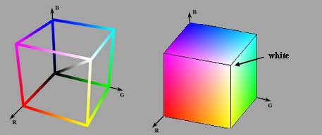
RGB cube
RGBA is a RGB color model with and additional alpha (opacity) channel. There is an open ended set of RGB spaces; anyone can invent one by picking new primaries and a gamma value. Some color spaces are commercial ones and copyrighted, some are defined for special purposes and some are obsolete.
Typically used in color printing, CMYK assumes that the background is white, and thus subtracts the assumed brightness of the white background from four colors: cyan, magenta, yellow, and black. Black is used because the combination of the three primary colors (CMY) doesn’t produce a fully saturated black. You should however be aware that some desktop printers have only an RGB interface. Some printers use special premixed inks called Spot Colors.
The Natural Color System (NCS) is a proprietary perceptual color model based on the color opponency hypothesis of color vision, first proposed by Ewald Hering. The current version of the NCS was developed by the Swedish Colour Centre Foundation.
HSV and HSL have been developed in 1978 by Alvy Ray Smith, a pioneer in computer graphics and cofounder of the animation studio Pixar. They are used today in color pickers. The two representations rearrange the geometry of RGB in an attempt to be more intuitive and perceptually relevant than the cartesian (cube) representation. The colors are represented in a cylindrical coordinate system. Twenty years later Alvy Ray Smith created HWB to address some of the issues with HSV and HSL. HWB came to prominence in 2014 following its use in the CSS Level 4 Color Module.
In contrast to color models which define a coordinate space to describe colors, the Color Apperance Model (CAM) is a mathematical model that seeks to describe the perceptual aspects of human color vision.
Color Spaces
A color space is a specific implementation of a color model. The physical colors represented in the coordinate space (cube, cylinder) of a color model are not all visible by humans. For this reason the International Commission on Illumination (CIE) defined in 1931 quantitative links between physical pure colors (wavelengths) in the electromagnetic visible spectrum and physiological perceived colors in human color vision. These links are represented as 3D regions (3D solids) containing all producible colors, called the CIE 1931 color space. The CIE 1931 color space standard defines both the CIE 1931 RGB space, which is an RGB color space with monochromatic primaries, and the CIE 1931 XYZ color space, which works like an RGB color space except that it has non-physical primaries that cannot be said to be red, green, and blue. The CIE standards are based on a function called the standard (colorimetric) observer, to represent an average human’s chromatic response.

Color Space : different vues of the 3D solid representing visible colors
Visualizing color spaces in 3D is not very easy and intuitive. For this reason color spaces are usually represented using 2D slices from their full 3D shape. Unless specified otherwise, a 2D chromacity diagram shows the cross-section containing all colors which are at 50% luminosity (luminance). The next figure shows the CIE 1931 XYZ color space in two dimensions.
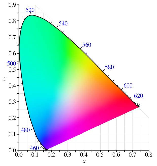
CIE 1931 XYZ color space at 50% luminosity (mid-tones)
The CIE defined additional standards for color spaces for special purposes like TV, video, computer graphics. A list is shown below :
- CIE 1960 UCS : Uniform Color Space
- CIE 1964 (U*, V*, W*) : CIEUVW = white point and luminous tristimulus value
- CIE 1976 (L*, u*, v*) : CIELUV = perceptual uniformity
- CIE 1976 (L*, a*, b*) : CIELAB = color-opponent space, replaced the Hunter color space
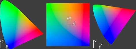
CIE color spaces : CIEXYZ, CIELAB, CIELUV
Gamuts
It’s good to know that the CIE XYZ color space encompasses all color sensations that an average person can experience, but it’s more important to know the subsets of colors that a given digital device can handle and reproduce. Such a portion of the CIE XYZ color space is called a device color space or gamut. The term gamut was adopted from the field of music, where it means the set of pitches of which musical melodies are composed. The following figure shows typical gamuts for some digital devices.

Typical gamuts of digital devices with 50% luminosity
Keep in mind that this representation only shows mid-tones with 50% luminosity. When colors are dark or light, we perceive less variation in their vividness. We see the maximum range of color saturation for middle-toned colors. This is why the 2D slices of color models are usually represented with 50% luminosity. If we are interested in the color gamuts for the shadows or highlights, we could look instead at a 2D slice of the color space at about 25% and 75% luminosity.
The following figure shows the gamuts of real devices, the iPad 2 and iPad 3.
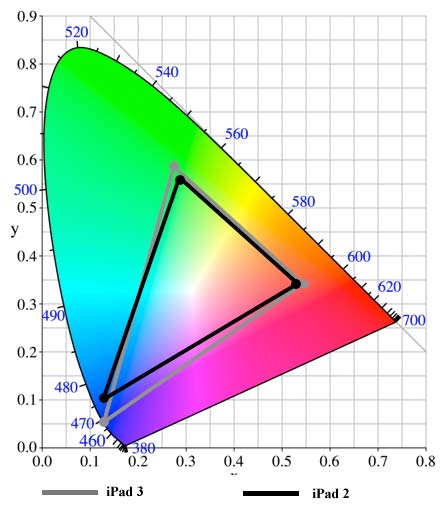
Gamuts of iPad 2 and iPad 3
Color Transformation
Color transformation (color space conversion) is the translation of the representation of a color from a source color space to a target (destination) color space.
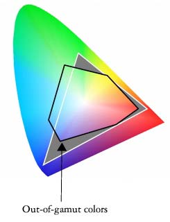
Out of
A typical use case is to print on an inkjet printer in the CMYK space a photo captured with a camera in the RGB color space. The printer gamut is different than the camera gamut, certain camera colors cannot be reproduced with the printer. Those colors are said to be out of gamut.
During the color transformation process, the RGB colors out of gamut must be converted to values within the CMYK gamut. This conversion is called gamut mapping. There are several reasonable strategies for performing gamut mapping, these are called rendering intents. Four particular strategies were defined by the International Color Consortium (ICC), with the following names:
- Absolute Colormetric
- Relative Colormetric
- Perceptual
- Saturation
If a complete gamut mapping is not possible, a gamut mismatch results and the best approximation is aimed. An interactive Flash demo explaining color gamut mapping is available at the website of the Stanford University.
In digital image edition programs (for example Adobe Photoshop), device independent color spaces, called working spaces, are used as a reference for the device-dependent gamuts. Working color spaces are color models that are well suited to image editing tasks such as tonal or color adjustments. The most important working spaces are listed below :
- PMS (1963) : Pantone Matching System
- sRGB (1996) : created by HP and Microsoft; the name of the corresponding international standard is sRGB IEC1966 2.1.
- Adobe RGB (1998) : (wide gamut), developed by Adobe Systems; equivalent to SMPTE-240M (Society of Motion Picture & Television Engineers)
- proPhoto RGB (2000) : large gamut, developed by Kodak
- Wide-gamut RGB : developed by Adobe as expanded version of Adobe RGB 1998; 8% of the colors are imaginary and therefore wasted
- ColoRotate (2012) : color space navigator
sRGB is sort of common denominator and used as default for unmanaged computers. This color space is appropriate for uploading images to the web and to send them for printing to minilabs if no custom space is specified. It has been endorsed by the W3C and by many industry leaders. sRGB is not well suited as working space because it has a narrow gamut.
Usually the input and output color spaces are smaller than the working color space.
Color temperatures
Color temperature is another characteristic of visible light that is important in digital imaging and photography. Color temperature is conventionally stated in the unit of absolute temperature, the Kelvin, having the unit symbol K. Color temperatures over 5.000K are called cool colors, while lower color temperatures (2.700–3.000 K) are called warm colors.
The color temperature of sunlight above the atmosphere is about 5.900 K. Tungsten incandescent lamps used formerly in the photography had a temperature of 3.200 K. The CIE introduced in 1931 the concept of the Standard Illuminant, a theoretical source of visible light. Standard illuminants provide a basis for comparing images or colors recorded under different lighting. Each of these is defined by a letter or by a letter-number combination.
Fluorescent lighting adds a bluish cast to photos whereas tungsten lights add a yellowish tinge to photos. Humans don’t generally notice this difference in temperature because our eyes adjust automatically for it. The process in digital system to compensate these color casts is called white balance. The goal is to correct the lighting so that white objects appear white in images. White balance can be done automatically or manually. Two standard white points are used in white balance : D50 and D65.
In digital imaging, it is important to know a monitor’s color temperature. Common monitor color temperatures, along with matching standard illuminants, are as follows:
- 5.000 K (D50)
- 5.500 K (D55)
- 6.500 K (D65)
- 7.500 K (D75)
The spectrum of a standard illuminant, like any other profile of light, can be converted into tristimulus values. The set of three tristimulus coordinates of an illuminant is called a white point and can equivalently be expressed as a pair of chromaticity coordinates.
Color Profiles
Informations about device gamuts and illuminants are registered in ICC profiles. ICC is the International Color Consortium which was formed in 1993 by eight vendors in order to create an open, vendor-neutral color management system which would function transparently across all operating systems and software packages. Every device that captures or displays color can be profiled. A profile can be considered as a description of a specific color space.
Profiles describe the color attributes of a particular device or viewing requirement by defining a mapping between the device source or target color space and a profile connection space (PCS, either CIEXYZ or CIELAB) serving as reference.There are two types of profiles :
- matrix-based : mathematical formulas
- table-based : large tables of sample points (LUT = look up table) to define the 3D color space
Mappings may be specified this way using tables, to which interpolation is applied, or through a series of parameters for transformations.
ICC profiles help you to get the correct color reproduction when you input images from a camera or scanner and display them on a monitor or print them.
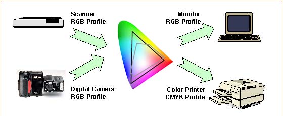
Color conversion with ICC profiles
An ICC profile must conform to the ICC specification. The latest profile version is 4.3.0.0, the corresponding specification ICC.1:2010-12 is technically identical to the ISO standard 15076-1:2010.
There are different device classes of profiles : input, output, display, link, abstract, colorspace, … ICC profiles may have the suffix .icc or .icm. Display profiles are commonly of the Matrix/TRC type with a 3×3 matrix of the colorant primaries tristimulus values and a one-dimensional tone curve for each colorant. They can also be of the multi-dimensional look-up table (LUT) type with a three-dimensional look-up table and a second one-dimensional tone curve. Some device-independant profiles are purely theoretical and describe a way to turn color into numbers. Others are device-dependant and describe the color signature of a particular device.
A profile does not correct anything in the image. An original with a color cast (Farbstich) keeps the cast during the color conversion. Image correction and cast removals are separate processes which need specific software.
ICC profiles can be embedded in digital images, for example in JPEG files. If the profile uses a standard color space like sRGB, a simple EXIF tag is sufficient to indicate it. If a custom (non-standard) color space is used, the complete data segment can be embedded. Photoshop features check-boxes to embed ICC profiles in dialog boxes when saving or creating images.
A free program for Windows to view the content of ICC profiles has been developed by Huan (Huanzhao) Zeng. The software is called ICC Profile Inspector; the current version 2.4.0 was updated on February 22, 2009. The following figure shows a screenshot of the program displaying the header and the tag table of the Blurb ICC Profile for Blurb books.
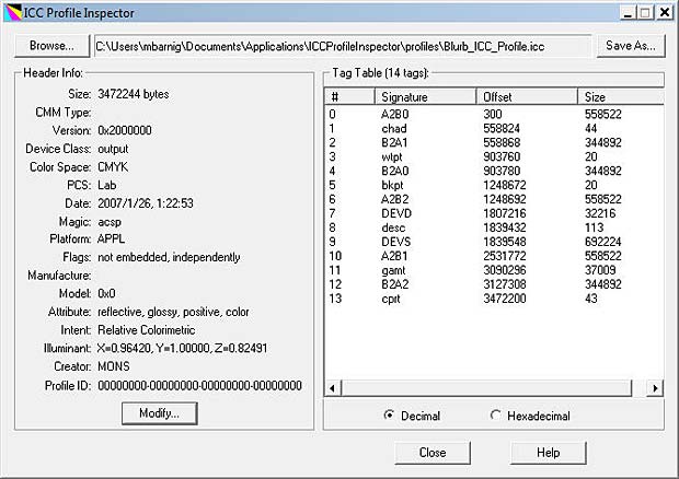
ICC Profile Inspector showing the Blurb book ICC profile
The device class of the Blurb ICC profile is output, the color space is CMYK, the profile connection space is Lab, the rendering intent is relative colormetric and the illuminant has the values X = 0.9642, Y = 1.0, Z = 0.82491. AToBn (A2Bx) and BToAn (B2Ax) are gamut mapping tables used in printer profiles. A refers to the device, B to the profile connection space. A2B tags are used for proofing, B2A tags are used for printing.
By clicking on a tag in the ICC Profil Inspector, the corresponding content is displayed.
The next figure shows a screenshot of the program displaying the header and the tag table of my Sony Vaio laptop :
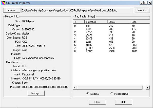
ICC Profile Inspector showing the ICC profile of a labtop display
The device class of the Sony ICC profile is display, the color space is RGB, the profile connection space is XYZ, the rendering intent is perceptual and the illuminant has the values X = 0.96419, Y = 1.0, Z = 0.82489. The tags rXYZ, gXYZ and bXYZ present the gamut for the three channels, the tag wtpt shows the white point, the tags rTRC, gTRC and bTRC indicate the Tone Response Curves for the three channels in 16bit mode (see gamma encoding later in this post).

ICC color profile for Sony Vaio labtop display : gamut, white point, gamma
Windows Color Management panel allows to change settings for the ICC profiles. Mac OS X has an inbuilt ICC profile inspector inside the umbrella application ColorSync Utility.
An OpenICC project was launched in 2004. Files are available at Sourceforge.
RAW to JPEG / TIFF conversion
To view our image, we must display it on a monitor or print it on paper. In both cases we need to process (edit) the image to cope with limitations of the output medium and with another particularity of the human vision. Compared to a photosensor, our eyes are much more sensitive to changes in dark tones than we are to similar changes in bright tones.
A standard computer monitor can only display 8 bits per color channel. The common image file formats used in this environment are compressed JPEG or uncompressed TIFF files. To convert our raw image into on of these standards, we need to apply several image adjustments; some are irreversible. Often these adjustments are done automatically inside the digital imaging system (camera, scanner), but it’s also possible to do it manually outside with an image editing software like Photoshop.
The steps to adjust the digital image are the following :
- Demosaicing
- Gamma encoding
- White Balance
- Tonal compensation
- Color Compensation
- Sharpening
- Compression
Demosaicing
Let’s come back to our photosensors without considering their dynamic range, sensitivity or bit depth. To create a color image from the captured photons in the photosensors, a first process is the Bayer Demosaicing to provide full color information at each image pixel. Different demosaicing algorithms are applied to improve the image resolution or to reduce the image noise. Small-scale details in images near the resolution limit of the digital sensor can produce visual artifacts, the most common artifact is Moiré.
Gamma encoding
To translate between our eye’s light sensitivity and that of a digital imaging system, a function called gamma is used. In the simplest case the nonlinear gamma function is defined by the following power-law expression:
Vout = A * Vin exp gammaVout and Vin are the input and output luminositye values, A is a constant (usually A = 1) and gamma is the exponent. A gamma value lower than 1 is called an encoding gamma, a value greater than one is a decoding gamma. In the first case the compressive power-law nonlinearity is called gamma compression; conversely the application of the expansive power-law nonlinearity is called gamma expansion. The term gamma correction is sometimes used for both processes.
We distinguish three types of gamma :
- Image Gamma
- Display Gamma
- System Gamma
The image gamma is applied on the raw image data before converting them to a standard JPEG or TIFF file and saving it to the memory card. The gamma encoding redistributes the native tonal levels into ones that are perceptually more uniform, making a more efficient use of a given bit depth. The encoding gamma is usually about 1 / 2.2 = 0.455.
The display gamma refers to the video card and monitor and compensate for the image gamma to prevent that the image is displayed too bright on the screen. The display gamma is usually equal to 2.2. On old Mac computers the value was 1.8.
The system gamma (viewing gamma) is the net effect of all gammas applied to the image. The system gamma should ideally be close to 1, resulting in a straight line in the gamma chart.
The following figures shows the three gamma plots :

Gamma charts image, display and system
The precise gamma is usually specified by the ICC color profile that is embedded within the image file. If no color profile is indicated, then a standard gamma of 1/2.2 is assumed.
Tone and color adjustment
We should now have a good understanding about colors, but we didn’t yet explained what are tones. Are tones synonymous to brightness ? Some specialists refer to musical allusions to define tones. Other say that tones include colors. Years ago in a photo forum it was stated that there are only two terms needed to specify tones and colors : hue and luminosity. Ken Bhasin concluded in this forum : “Tone is the degree of greyness. If the subject has color, imagine taking away its color – what remains is its tone. Absence of any tone makes a subject bright (light grey/white). Presence of a tone makes a subject dark (Dark grey/black).” I endorse this definition.
There are several tools to adjust or correct tones and colors. Most are interrelated and influence both tones and colors. The most common tools are presented hereafter with reference to the Photoshop software.
Levels is a tool which can move and stretch the levels of an image histogram. It adjust brightness, contrast and tonal range by specifying the location of complete black, complete white and midtones in a histogram.
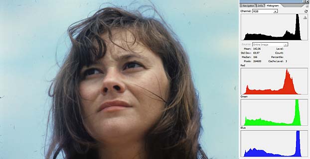
The following example shows two Kodachrome slides scanned with a cheap diascanner Maginon FS6600.
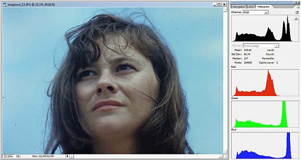
Scanned Kodachrome portrait with histograms
The histograms of the three color channels indicate an underexposure.

Color adjustment with Levels Tool in Photoshop
By moving the white point to the left in the R, G and B histograms in Photoshop the levels are adjusted. Holding down the ALT-key while dragging the black or white slider is a trick to visualize shadow or highlight clipping and avoid it.
Adjusted portrait
Because the levels have been modified differently in the three color channels, the adjustment influenced also the hue of the image.
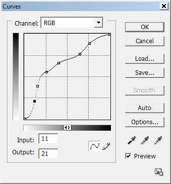
Photoshop curves tool (non-sense adjustment)
A second tool is the Photoshop curves. It’s a very powerful and flexible image transformation utility. Similar to Photoshop levels, the curves tool can take input levels and selectively stretch or compress them. A curve is controlled using up to a total of 16 anchor points. The left figure shows an example of an (artistic nonsense) curve applied to the preceding portrait. The curves tool only redistributes contrast and allow us to better utilize a limited dynamic range. You can never add contrast in one tonal region without also decreasing it in another region. You must decide how to spend your contrast budget. Curves also preserves the tonal hierarchy, unless there are negative slopes in it. The following figure shows the resulting modified image.
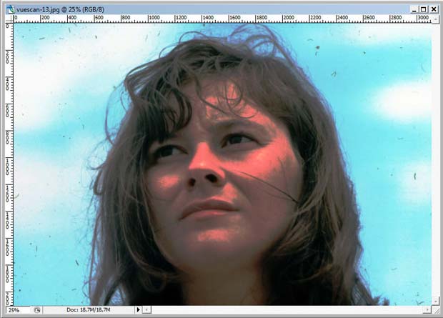
Portrait modified in Photoshop with the Curves Tool based on nonsense points
Curves can also be used on individual color channels to correct color casts (Farbstiche) in specific tonal areas. A typical example of digital images with color casts are scanned film negatives which have a strong orange mask. The reason an orange mask was added to color negative films was because of imperfections in the cmy dyes.
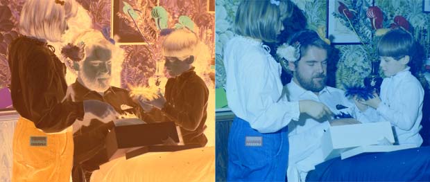
Scanned film negative
The orange color cast becomes purple when the image is inverted to a positive. All film scanning software comes with color negative options. Typically a variety of color negative film types, such as Kodak Gold 100, Agfa, Fuji etc are listed in the scanner software. A good scan should avoid clipping in all the color channels, which can be easily checked in the histograms.
If the scanned image is not converted to a positive in the scanner, it can be done in Photoshop. The third Photoshop adjustment tool, called eyedropper (pipette), is well suited for this purpose. The eyedropper figures in the levels and curves panels (see figures above). The far left dropper tool is used to set the black point by clicking on a location within the image that should be black. The far right dropper tool does the same for the white point. The middle dropper tool sets the grey point which is an area in the image that should be colorless.
In a negative white and black are inverted. The lightest part of the negative (the darkest part of the scene) can be no lighter than the color of the base orange cast. If the orange cast can be converted to pure white in the negative (black in positive), then the remainder of the colors will be converted as expected. The next figure shows the areas where the eyedropper tool has been applied and the resulting inverted positive.
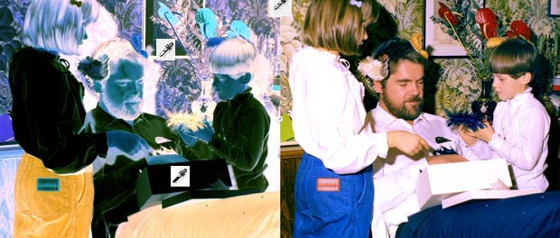
Adjusted negative with the dropper (3 areas black, white, grey) and resulting positive
The global adjustment of the colors is called color balance. If the goal is to render specific neutral colors correctly, the method is called grey balance, neutral balance, or white balance respectively. General color balance changes the overall mixture of colors in an image and is used to get colors other than neutrals to appear correct or pleasing.
Photoshop offers various methods to automatize tone and color adjustments :
- Auto Levels
- Auto Contrast
- Auto Color
- Photo Filter
- Special filters like ColorPerfect
Photoshop provides also various sliders to adjust manually the parameters color balance, brightness, contrast, hue, saturation, exposure, shadows, highlights etc. A great help is the Photoshop Variations Tools showing incremental changes of different parameters in images, with an indication of eventual clippings. The next figure shows variations of the portrait image for the shadows, mid-tones, highlights and saturation.
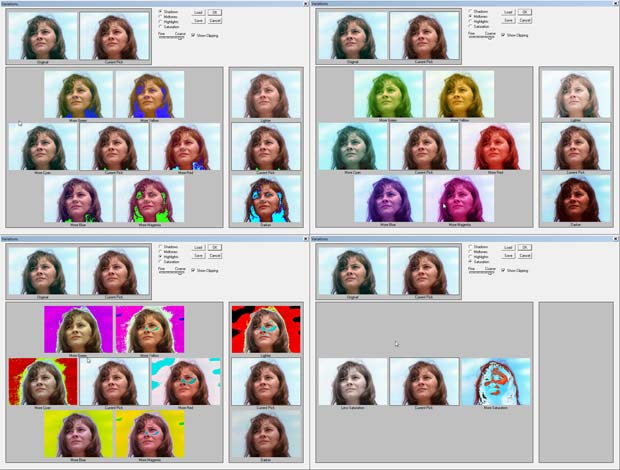
Photoshop Variations
Another method to automatize color balance used by several image editors are selectors for presets, for example :
- landcsape
- portraits, skin tones
- night
- beach
- jewelry
Sharpening
The next step in the image processing workflow is sharpening. Resolution adds the detail that lets us recognize features. Sharpness makes edges clear and distinct. The standard tool of choice for sharpening is the UnSharp Mask filter (USM).
All color filter Bayer array algorithms, by definition, blur the image more than could have been theoretically captured by a perfect camera or scanner. Thats why sharpening is often integrated in the demosaicing process. If not, it can be done separately in an image editor like Photoshop.
Compression
A last step in the image processing workflow is compression to reduce irrelevance and redundancy of the image data in order to be able to store or transmit data in an efficient way. Image compression may be lossy or lossless.
The common image formats used in digital imaging today are JPEG and TIFF.
Color Management
Color management is the cross-platform view of all the features presented in the present post, based on ICC standards. Wikipedia defines color management in digital imaging systems as “the controlled conversion between the color representations of various devices. A color management system transforms data encoded for one device (camera, scanner) into that for another device (monitor, printer) in such a way that it reproduces the original colors. Where exact color matching is not possible, the result should be a pleasing approximation.”
Parts of the color management technology are implemented in the operating system (OS), for example ColorSync in Mac OS X and Windows Color System (WCS, formerly ICM) in Windows. Other parts are included in applications (for example Photoshop) and in devices (for example cameras). An open source color management called Little CMS (LCMS) was initiated by Marti Maria in 1998. LCMS is released under the terms of the MIT License as a software library for use in other programs which will allow the use of ICC profiles. The current version is 2.7, updated on March 17, 2015, available on Github.
Calibration
Profiling a device is called characterization. Instruments used for measuring device colors include colorimeters and spectrophotometers. Calibration is like characterization, except that it can include the adjustment of the device, as opposed to just the measurement of the device. When all device are calibrated to a common standard color space such as sRGB, no color translations are needed to get all devices to handle colors consistently. Monitors, scanners and printers are the common devices that can be calibrated.
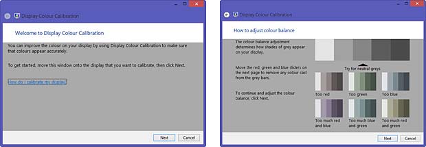
Windows Display Calibration Tool
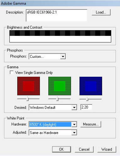
Display Calibration Tool Adobe_gamma
Modern monitors include a factory-created profile that is loaded into the monitor firmware and is communicated to the computer. Some people prefer to replace these profiles with custom ones. Most operating systems include tools to calibrate the monitor. Adobe Gamma is a monitor calibration tool included in Photoshop.
Color charts such as IT8 are used to calibrate scanners. Printers should be calibrated for every type of paper and inks you use. One solution is to print a test chart and to scan it with a IT8 calibrated scanner. Scanner software like SilverFast calculates then an ICC profile for the printer and the paper and ink combination.
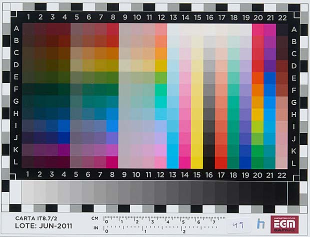
IT8 color chart
Photo Restoration
Digital photo restoration uses specific image editing techniques to remove visible damage, fading, color casts and other aging effects from digital copies of physical photographs. The most common tools are :
- levels, curves, contrast and black level tools to remove fading
- white balance, color balance and other color tools to remove color casts
- clone stamp, healing brush and other selective editing tools to remove localized damage
Conclusions and recommendations
The human eyes and brain work together to create what we call vision. The eyes collect input and send it to the brain for processing. It’s the brain that decides what it is we see (or think we see). The brain makes its decisions based largely on perceived color and contrast data sent to it by the eye’s sensory elements such as cones and rods. Sometimes these decisions don’t match reality which can give rise to what we know as optical illusions. The human vision still performs better than the most complex digital imaging system.
Here are some rules based on the explanations given in the present post to guide you through the digital imaging process :
- use Adobe RGB as a working space for 8 bit images and ProPhoto RGB for 16 bit images
- assign the sRGB profile as default for unprofiled images
- use a generic CMYK profile for printing if the printer does not supply a custom profile and if it’s not restricted to an RGB interface
- use perceptual as default rendering intent; it’s the best choice for general and batch use and for images with intense colors
- use relative colormetric rendering intent for images with subtle tones (portraits); they benefit from the increased accuracy
- apply the Photoshop Curves Tool only to 16 bit images
Links
A list with links to websites providing additional information about digital imaging is shown hereafter :
- Color Models
- Philipp Otto Runge’s Color Sphere, by Rolf G. Kuehni
- Exposé d’un moyen de définir et de nommer les couleurs, Michel Eugène Chevreul
- A Guide to Understanding Color Communication, by X-Rite
- A Color Managed Raw Workflow – From Camera to Final Print, by Adobe
- RGB Working Space Information, by Bruce Lindbloom
- Photography Improvement, by Ed Knepley
- White Balance, by Ron Bigelow
- Exploring the World of Color Theory with a 3D Modeling Program, by Mark Meyer
- L’aquarelle : la peinture de la lumière, par Diane Forest
- dot color : All about color quality and display technologies, blog by Jeff Yurek
- The role of working spaces in Adobe applications; technical paper by Andrew Rodney
- Color management: Implementation part 1, by Norman Koren
- Photoshop History, by Creative Overflow
- Complete guide to color management, by X-Rite
- How to Calibrate Your Monitor in Windows and OS X, by Aseem Kishore
- Neutralizing Color Casts With The Photo Filter In Photoshop, by Steve Patterson
- Tips on digital photo restoration, by Cambridge in Colour
- Enhance Image Quality While Decreasing File Size, by Xsight Technologies
